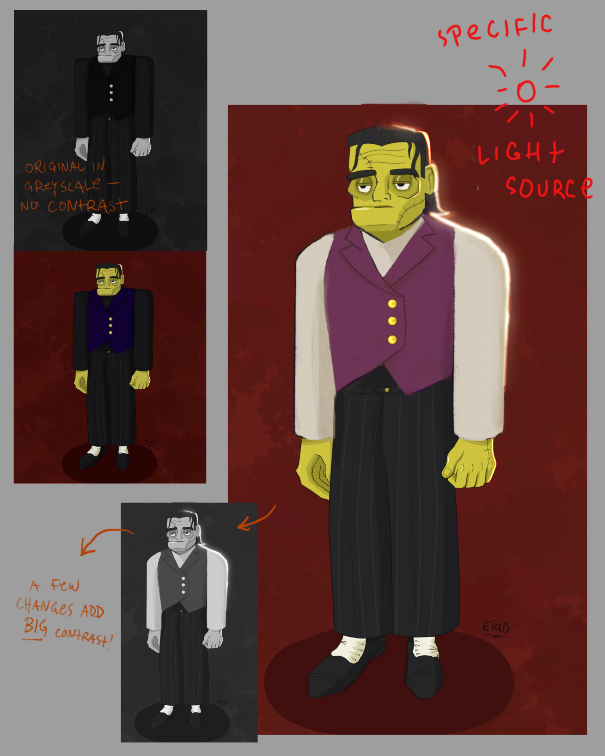

Hi! I think it’s great you’re re-imagining the design of such a classic character. I think the reason this design feels ‘flat’ is two-fold - your values are too alike, and the posing/shape language is very static. Regarding the values, the darkness of the clothing, hair, and even the background are very similar. If you squint, the only thing that pops is the skin tone. This high contrast creates an extreme flattening effect because your soft shading is totally lost against the much more noticeable light/dark local color difference. When I work digitally, I often briefly toggle a greyscale filter over my art as I render - this lets me check my values without having to think about color. Secondly, the posing and shape language make the figure feel very stiff. The idea of using this recurring square shape helps suggest the manufactured nature of the creature, but it’s bit overused here to the point where he looks very blocky and immobile. Try switching up some of your shapes and posing, and I think you’ll notice a big difference! I’m attaching an edit of your artwork to demonstrate how a few small changes can make a big impact. I hope this helps, and happy drawing!
Zeige Bild von @ subjectively27220135
Anstriche (1)
Kommentare 1
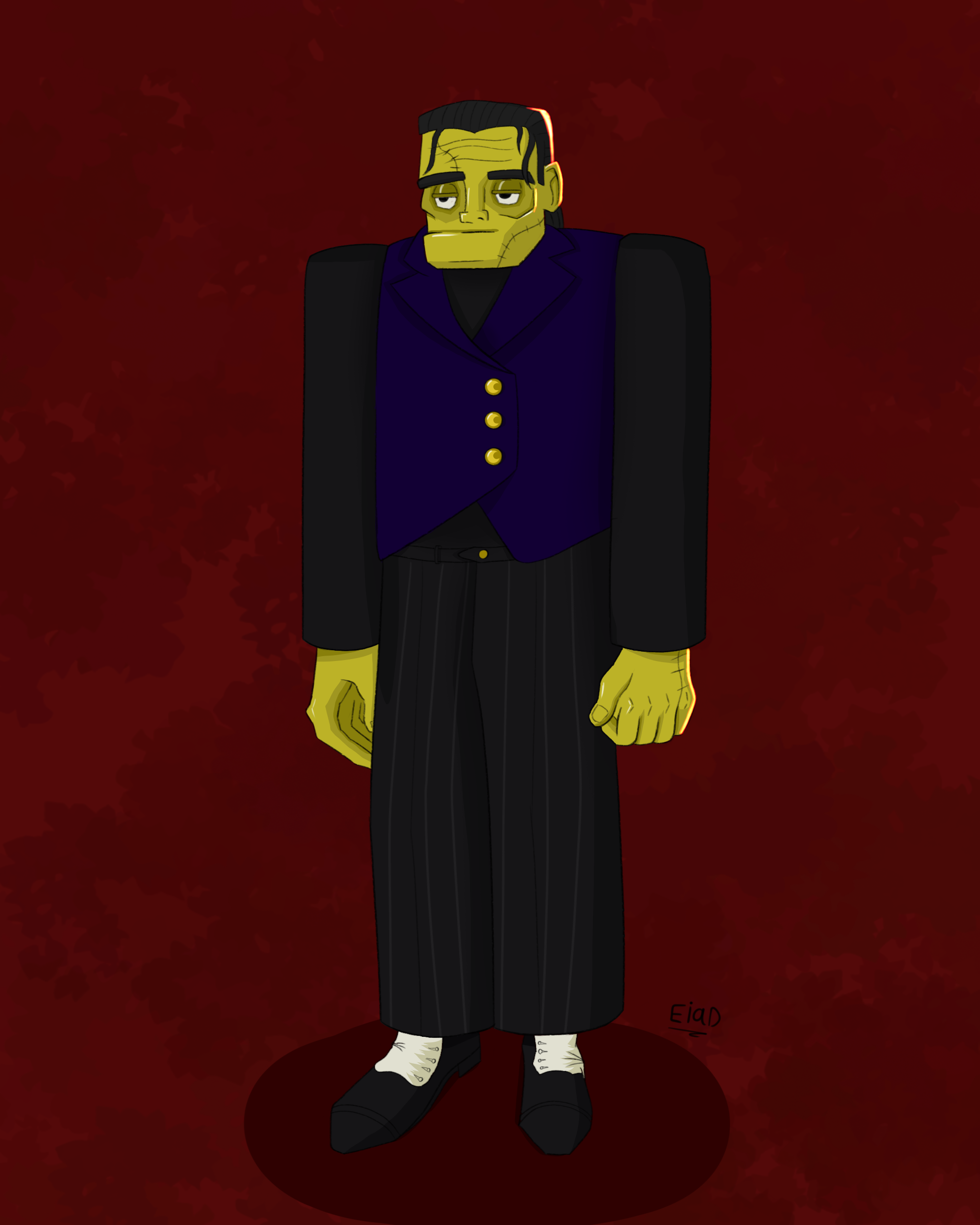
I made this design of Frankenstein's Creature. It's not the typical Frankenstein but I did what I imagined from the book. I'm not really satisfied with the resault because I feel it looks too flat. I always have this problem no matter how hard I practised the fundamentals. Any tips and improvments would be welcomed generally.

Künstlernotiz:
I made this design of Frankenstein's Creature. It's not the typical Frankenstein but I did what I imagined from the book. I'm not really satisfied with the resault because I feel it looks too flat. I always have this problem no matter how hard I practised the fundamentals. Any tips and improvments would be welcomed generally.
10