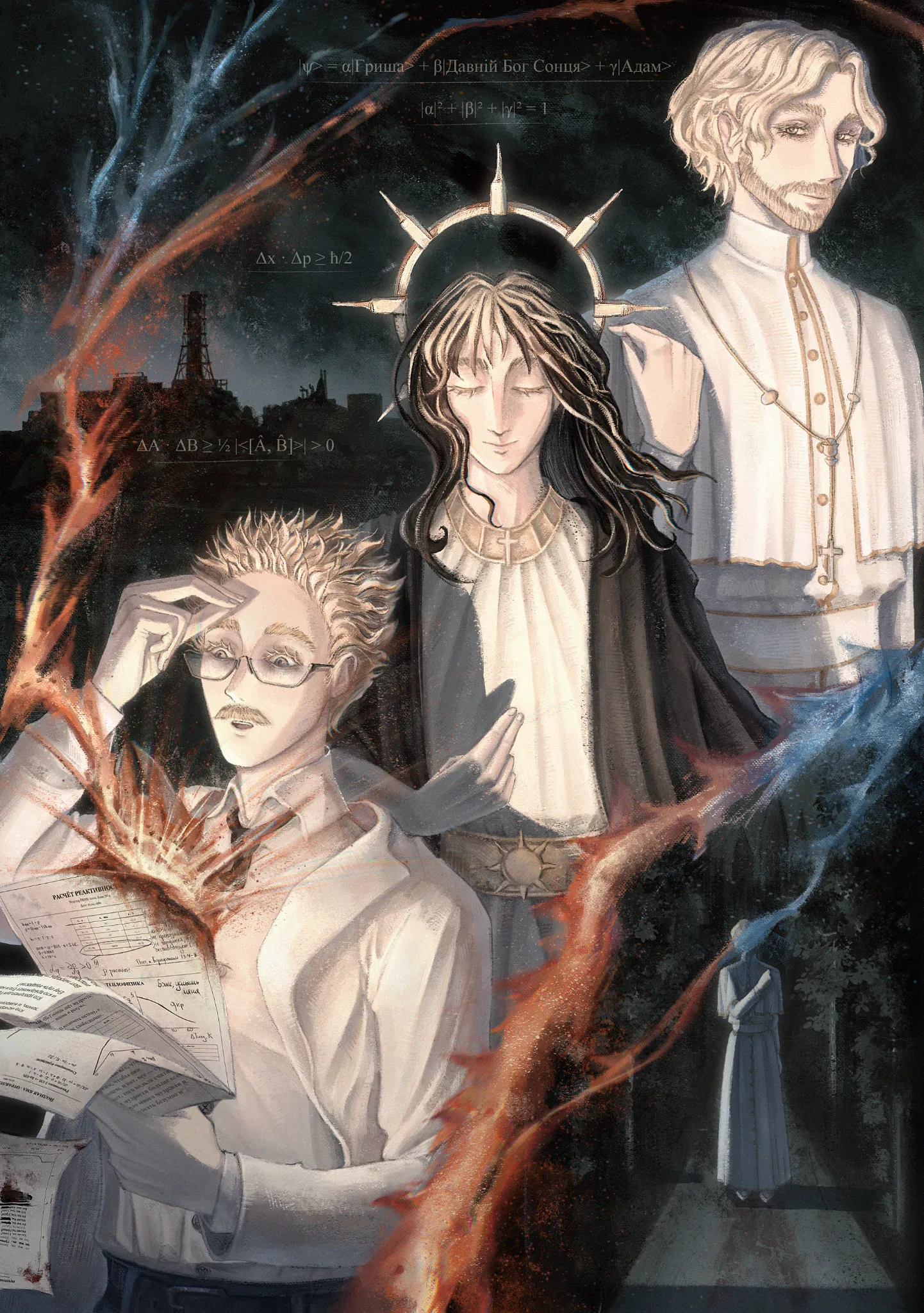
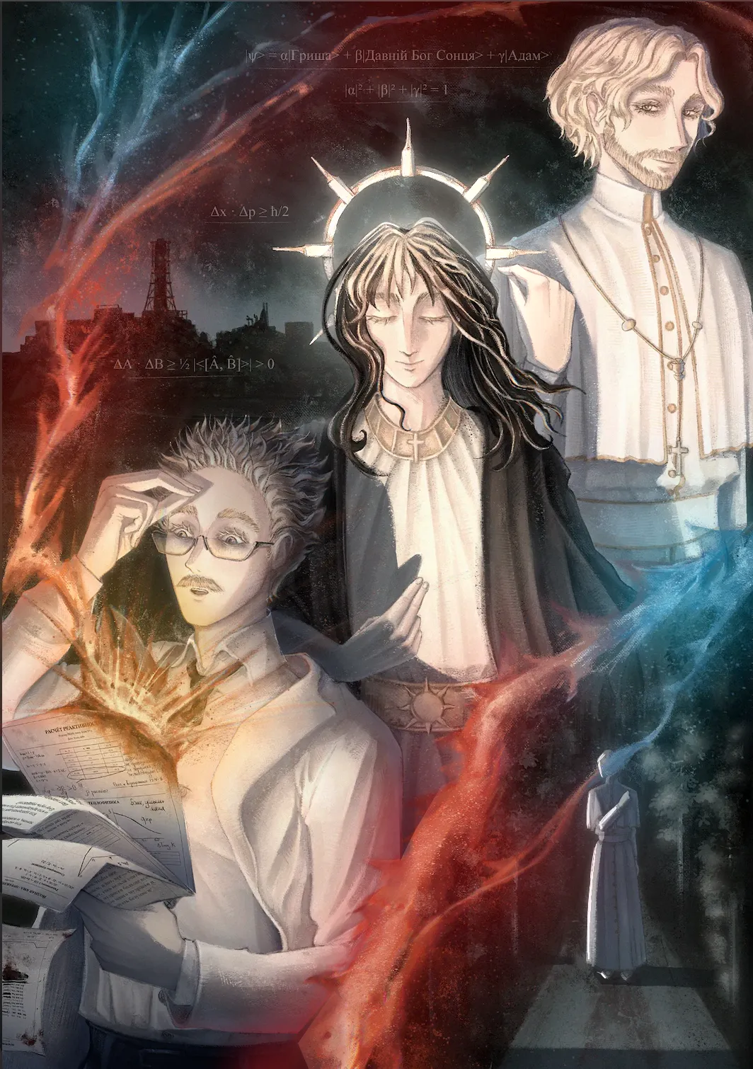

First of all, congratulations, it’s a really great drawing! I also love the texture and the composition. The only "correction" I’d suggest, which is really just a matter of adding a few extra effects, is to incorporate more secondary lights and shadows. You’ve already done a fantastic job with the lighting and shading; it’s clear you’ve put in a lot of time and carefully considered their placement. So, here’s a little trick to help separate the characters from one another or to distinguish adjacent elements that share similar colors without having to spend hours on it: use gradients! It couldn’t be easier! Just select a specific area—for instance, a character’s head—and, on a separate layer set to "Multiply" mode, add a subtle gradient where the shadow should be. Et voilà! Since you’ve already established your primary lights and shadows, this adds an extra layer of transition, making the drawing feel even more cohesive, while also slightly deepening the darkest parts of your shadows. I applied this technique to the character in the bottom-left corner—specifically on the papers, the area behind him, the hand holding the papers, and the inner part of his lab coat—focusing on spots where elements seemed to blend into each other, or where a slightly stronger shadow would be appropriate. The color I used is a grayish-blue tone (Hex code #5A667E, or Red: 90, Green: 102, Blue: 126)—but you can choose any color you like. Just be careful not to pick one that’s too dark, otherwise the gradients might end up being too intense! Still using the gradient technique, I added a colored tint where the body meets these intense lights. This time, however, the layer is set to "Normal" rather than "Multiply." If you want to make them even brighter, once you’ve finished adding these reflected lights, you can duplicate the layer and set it to "Add (Glow)" at around 20% opacity. This will boost the brightness of the lights without overdoing it—though, of course, you can adjust the opacity to your liking; I personally find that 20% usually works well. Another adjustment I made was adding a sort of halo effect beneath the red and blue light trails. Using a large, soft airbrush, I traced along the path of the light. Why? To make it appear more luminous and help it stand out further from the black background. This is an extra step—I’m not sure if it’s something you’ll find useful, but I felt it added a bit more visual interest to the drawing. It might also be a nice touch to make the central character’s "crown" glow, as if it were a true halo. I simply added a gradient beneath the crown and another one over the hair—both on layers set to "Add (Glow)." One last thing: in the bottom-right area, try adding a bit more light to the foliage and the figure to make them stand out more. It really wouldn't take much—even just a simple contour line would work well, in my opinion. I hope my explanation makes sense; feel free to ask if you have any questions. Once again, great job on the drawing! These are just a few extra notes based on techniques I personally like. The piece is already very strong, and it’s entirely up to you whether or not you’d like to experiment with this adjustment.

AAA YOU'RE A LIFE-SAVER, thank you so, so much for the detailed advice and all the explanations! It's genuinely so helpful, and I'll definitely try to experiment more with gradients!! Thank you!!
Antwort an @ {{handle}
I'm glad they were helpful to you! I hope to see more drawings from you, keep up the good work!