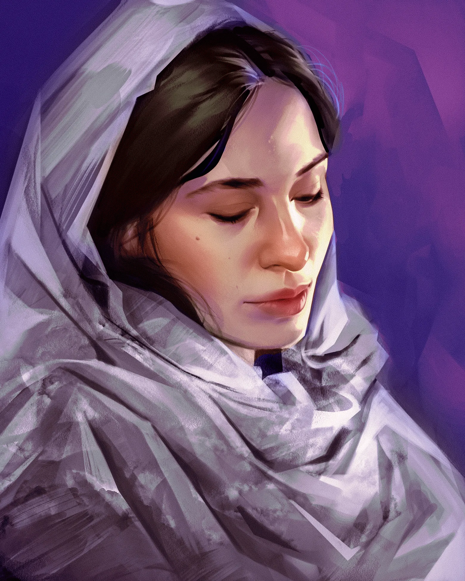
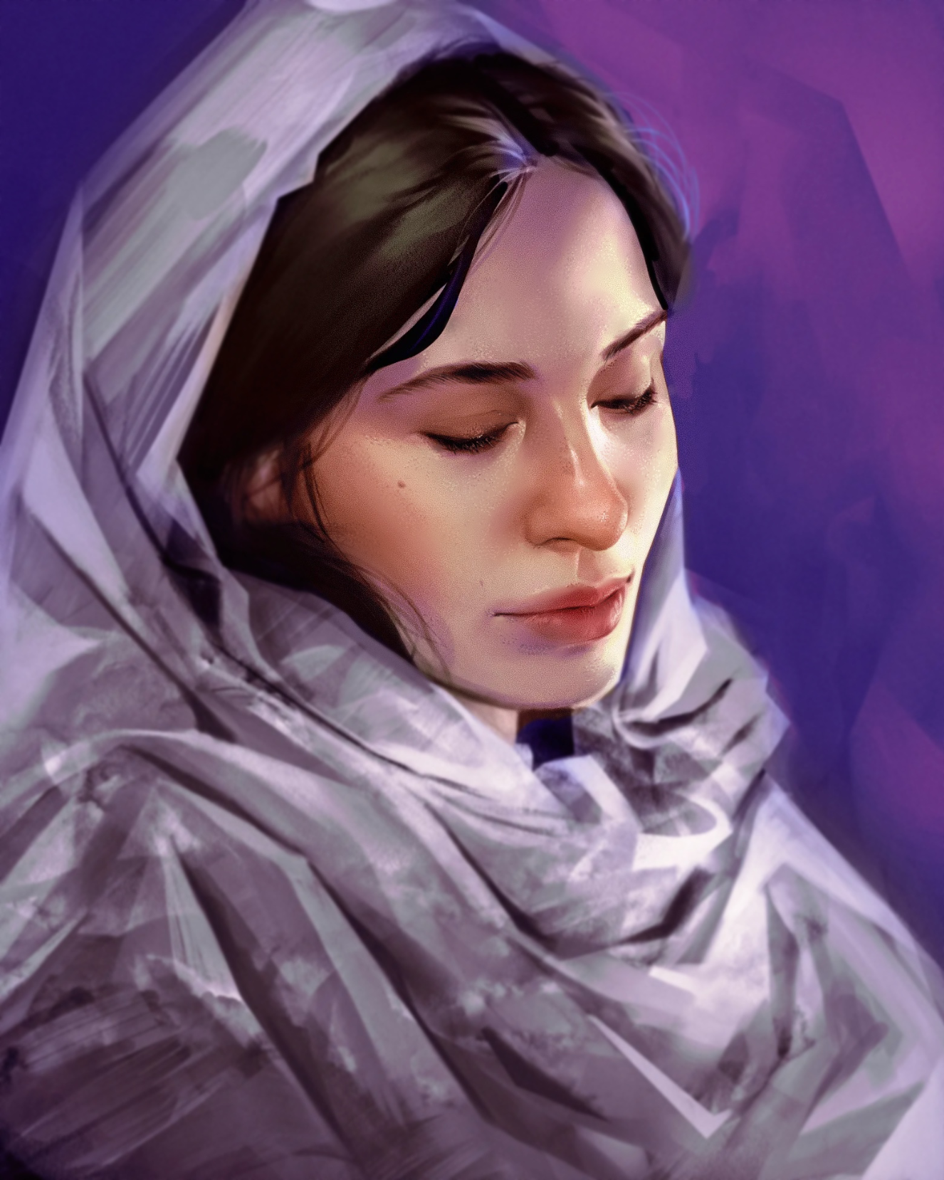
I actually disagree with a paintover here. It made it more smooth, yes, but I actually like how you rendered the face originally. Frankly said I don't think there anything wrong with this piece and it does look finished as is.
Anstriche (1)
Kommentare 3

Hi, I think for rendering you could benefit simply from adding more details. Your portrait already has a great foundation and it shows that you already have a strong understanding of values and form, but with your concerns of wanting it to be more refined and commercial I’d say just sizing your brush down, and taking the time to make those micro value changes in the details could help. In the paint-over, all I did was add pores, smaller transitions, and softened the hardened edges to hopefully give you an idea of how smaller details could give you that look you might be going for if I’m understanding correctly. Also I don’t think the hair or cloth being rough throws it off, but it means the face should be less rough in comparison or vice versa. So I made the edges a little more gradual in the face. I’m more of a stylized painter but as far as rendering goes I think all might be looking for is details, so smaller values and smaller edges. Hope this helps!!

The face is definitely where the eye gets drawn to! The headdress texture looks fine and cohesive. The hair looks very sleek and delicate. I'm not at all sure what you mean by 'commercial quality', but it's a wonderful, soulful portrait with very nice, complex lighting, so I'm really not sure what's bothering you 😅

Thank you Stibniteart! I appreciate the feedback. It's hard to put into words, but I think there's missing detail / the details I have are not refined enough.
Woman
Künstlernotiz:
I would like to know, in terms of rendering / colour, how I can improve this. Does the hair look too stiff? Too unrendered? The headdress was supposed to be more rough compared to the face, so that more attention is paid to the face, but I wonder if the texture looks too plastered on, or if it throws off the composition. It just doesn't feel like a finished, quality piece. There isn't a commercial quality to it: and I think a lot of my work has the same feeling, but it's hard for me to pin point where I'm going wrong
12