Feedback speichern?
Melde dich an, um dein Feedback an einem Ort zu haben. Ihr Feedback ist privat statt öffentlich.
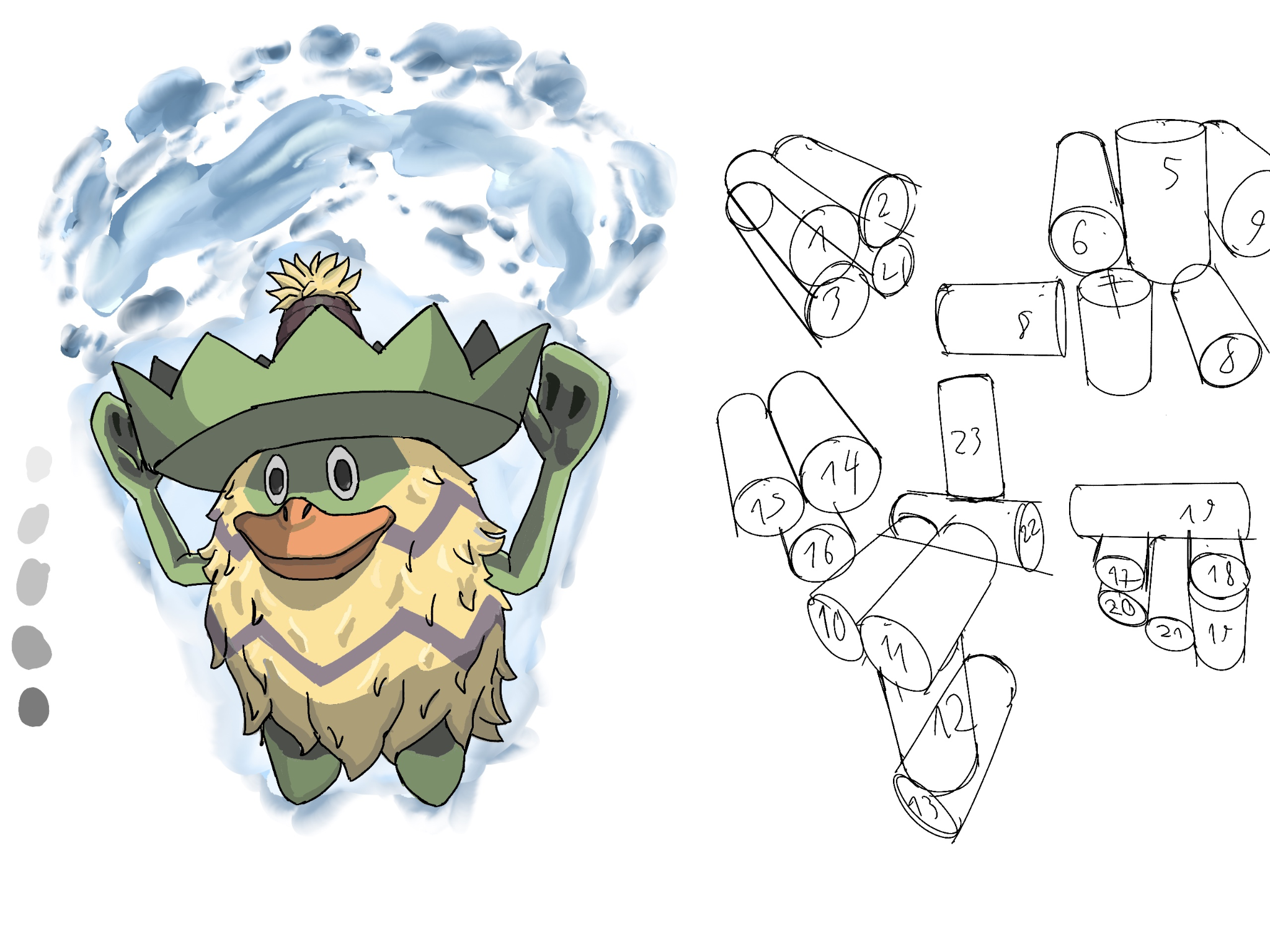
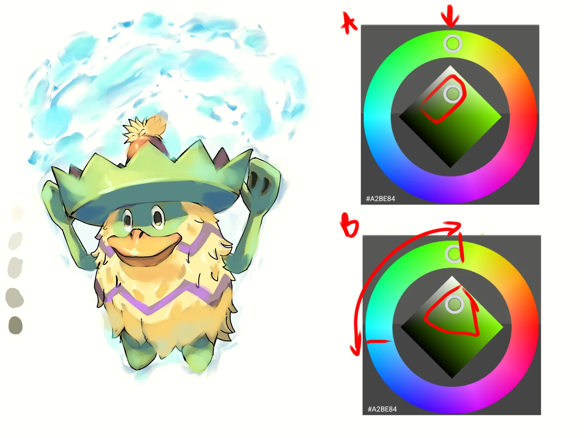
Anstriche
Paintover Notes
Wähle einen Lack
Wähle einen Avatar, um seine Notizen zu sehen und zu besprechen.
Brauche auch Hilfe bei Rendern?
Verbessere deine Tonwerte und Verläufe, Lesezeit: 3 Minuten
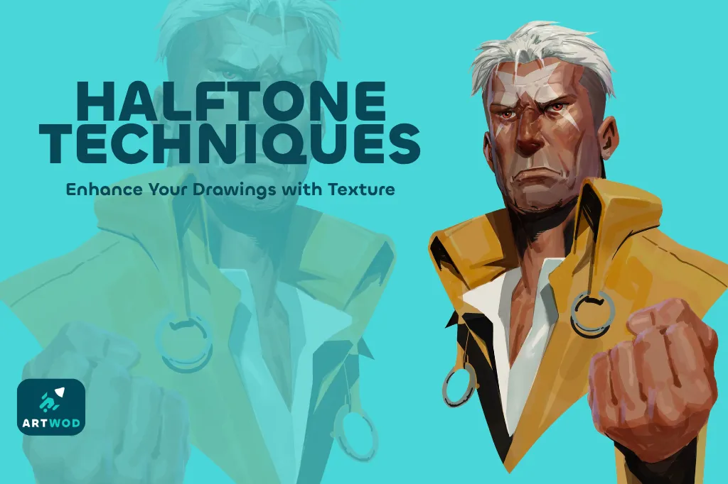
Halftone Techniques: Adding Texture and Depth to Your Artwork
Master halftones by establishing shapes, volumes, and shadows first, then practicing on beans, noses, portraits, and posters to add texture and depth to your artwork.
Rendering
Möchtest du jemandem helfen, der noch immer wartet?
Rendering
Noch keine Antwort
Does this work
It should work
Ansehen
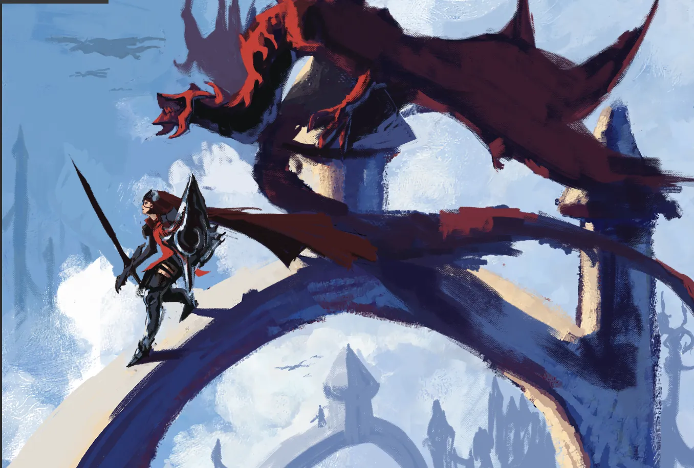
Environment
Noch keine Antwort
My Artwork
I'm struggling with perspective, form&depth, composition, values, light/color, anatomy, design
Ansehen
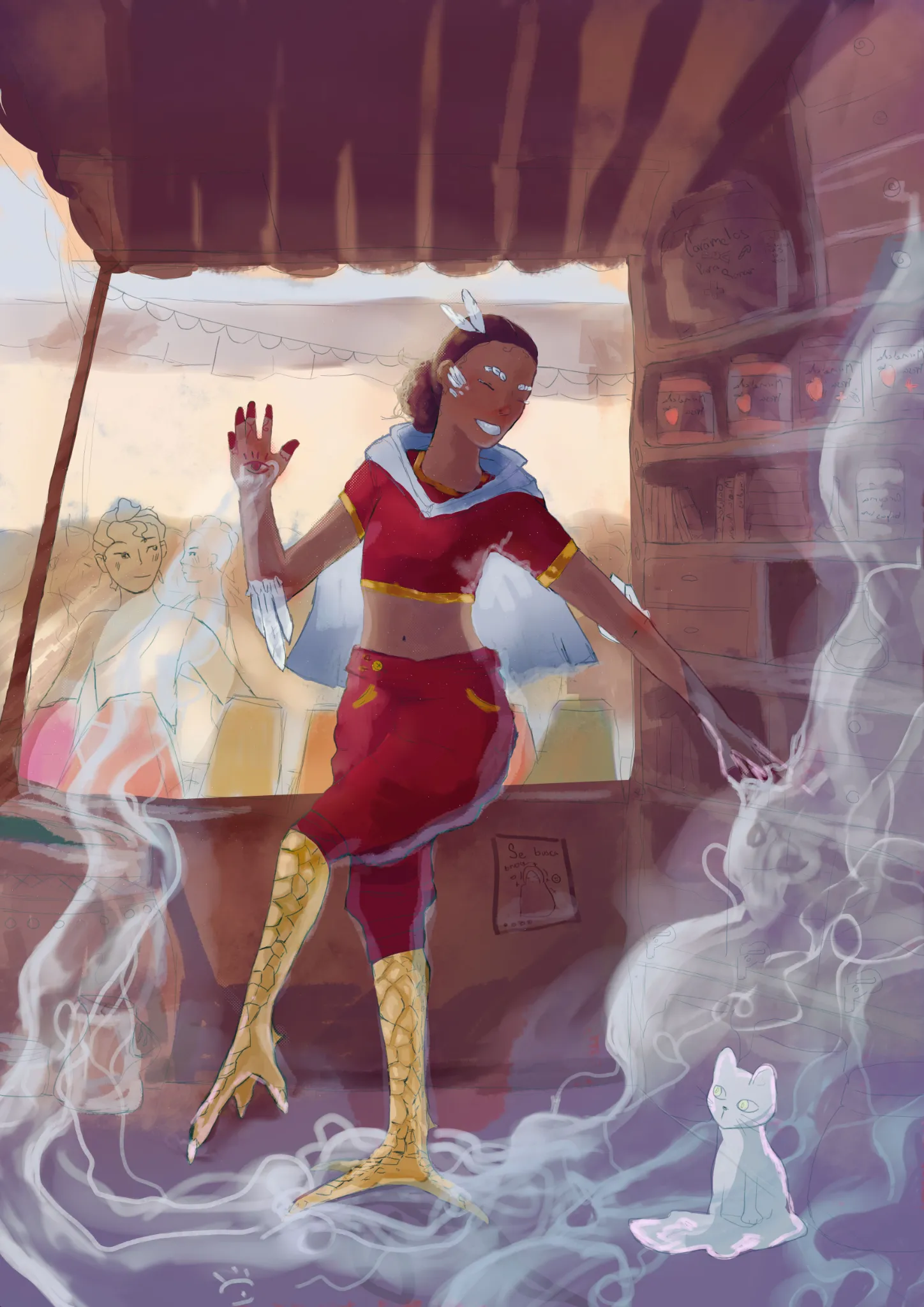
Rendering
Noch keine Antwort
My Artwork
I'm struggling with perspective, composition, values, light/color, anatomy, line quality
Ansehen
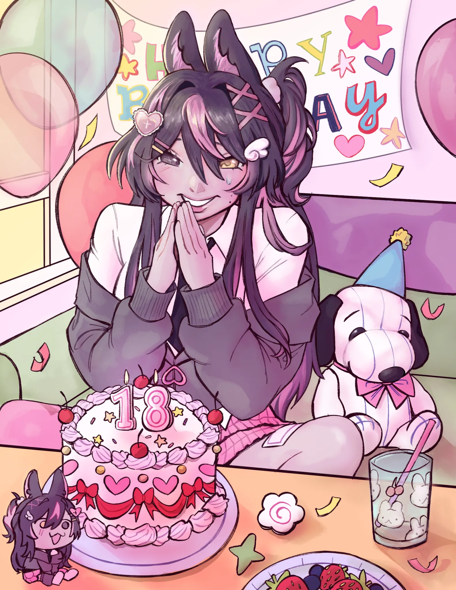
Anime
Noch keine Antwort
My Artwork
I'm struggling with perspective, form&depth, composition, values, light/color, anatomy, design
Ansehen
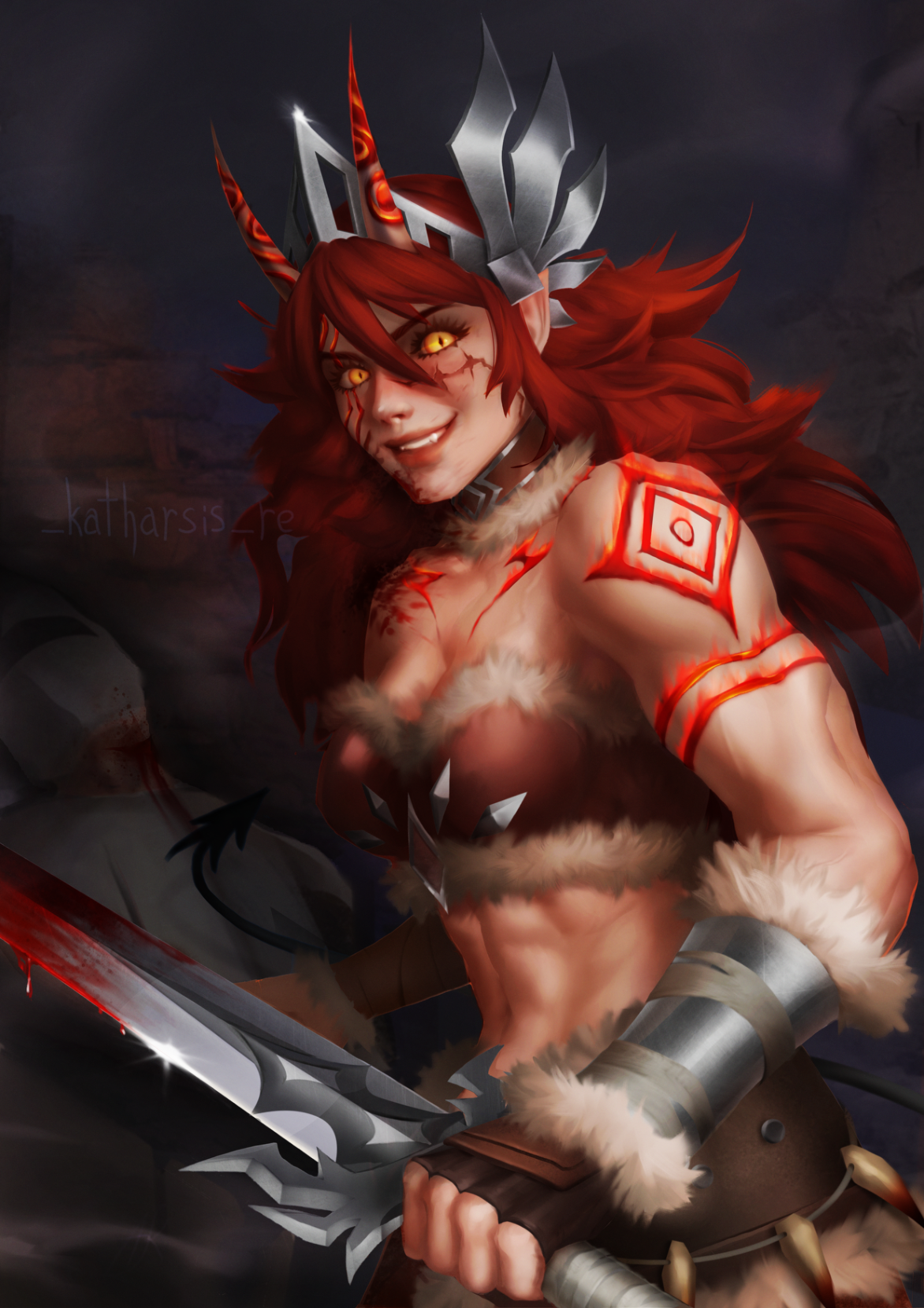
Rendering
Noch keine Antwort
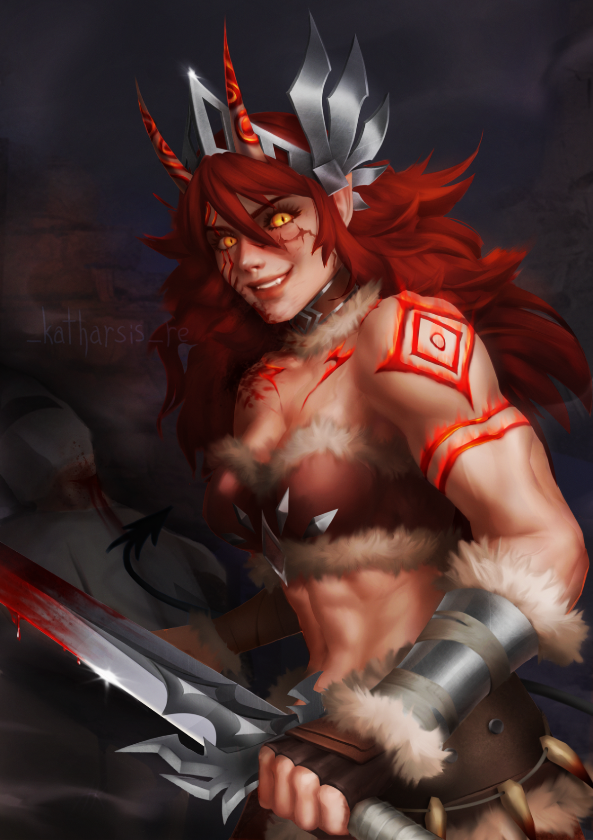
Azazela
Hi, its my second art in technique from grayscale to color. I don’t know, i did grayscale and I really like the values, details etc, but when i colored it - it seems like colors have ruined my values( Also that thing with front hand - i mean to do perspective deformation but it looks weird
Ansehen
Rendering
Noch keine Antwort
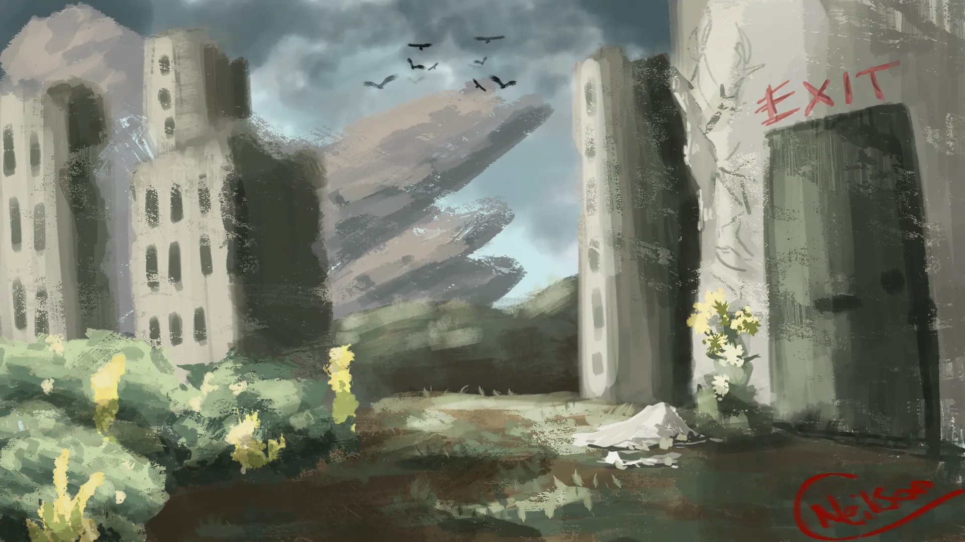
Azazela
Hi, its my second art in technique from grayscale to color. I don’t know, i did grayscale and I really like the values, details etc, but when i colored it - it seems like colors have ruined my values(
Ansehen
Environment
Noch keine Antwort
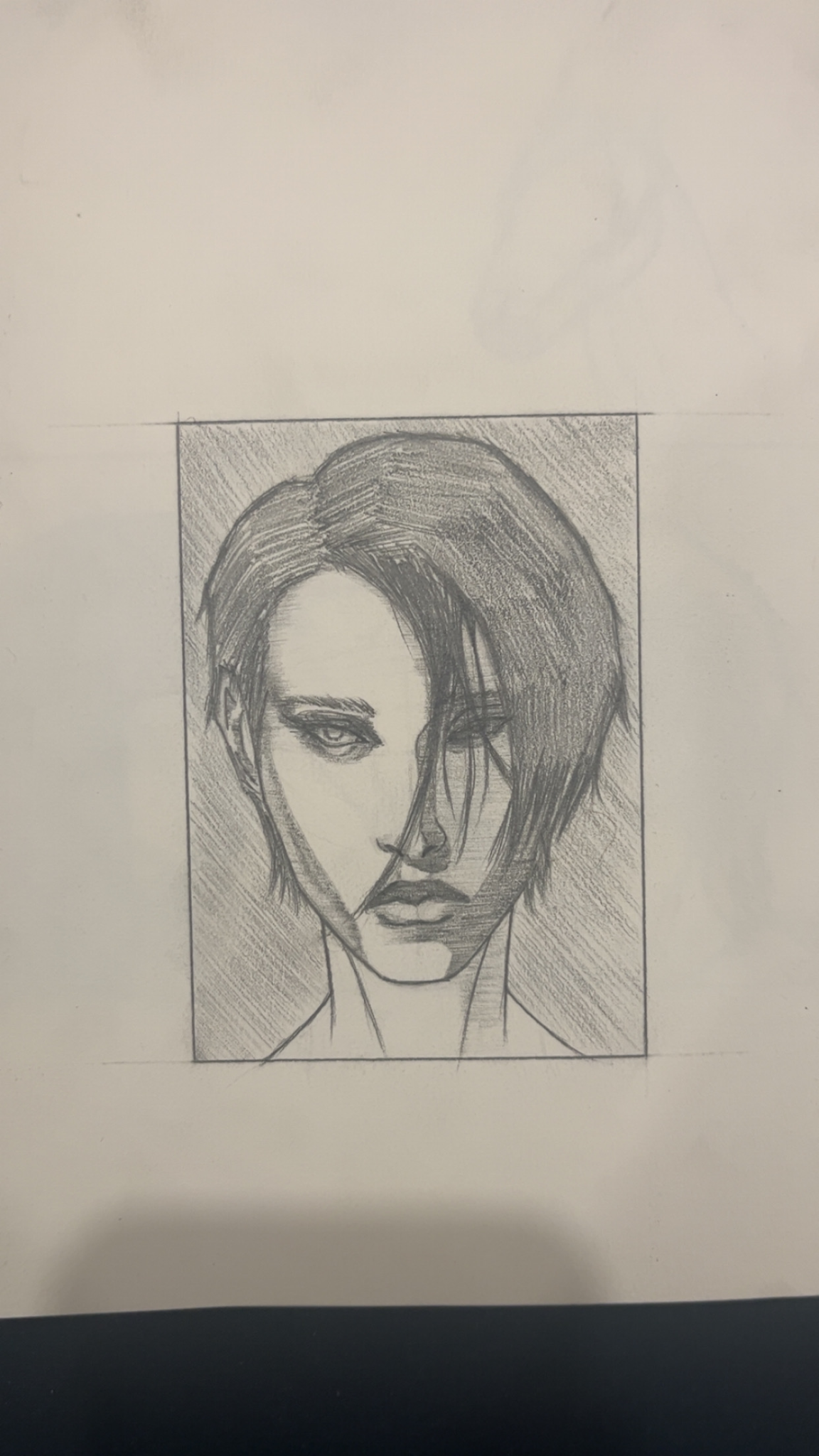
My Artwork
I'm struggling with form&depth, composition, light/color, line quality
Ansehen
Portraits
Noch keine Antwort
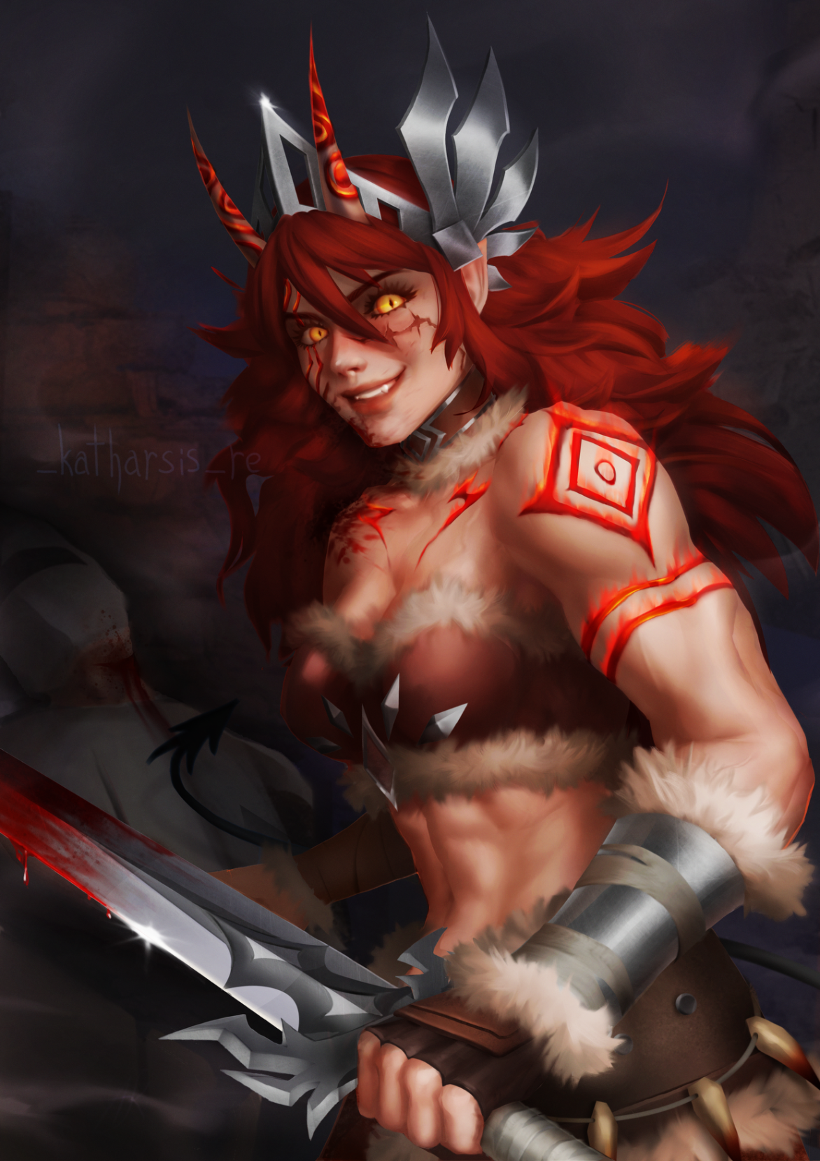
My Artwork
I'm struggling with composition, values, light/color, anatomy
Ansehen
Rendering
Noch keine Antwort
My Artwork
I'm struggling with perspective, form&depth, composition, values, light/color, anatomy
Ansehen