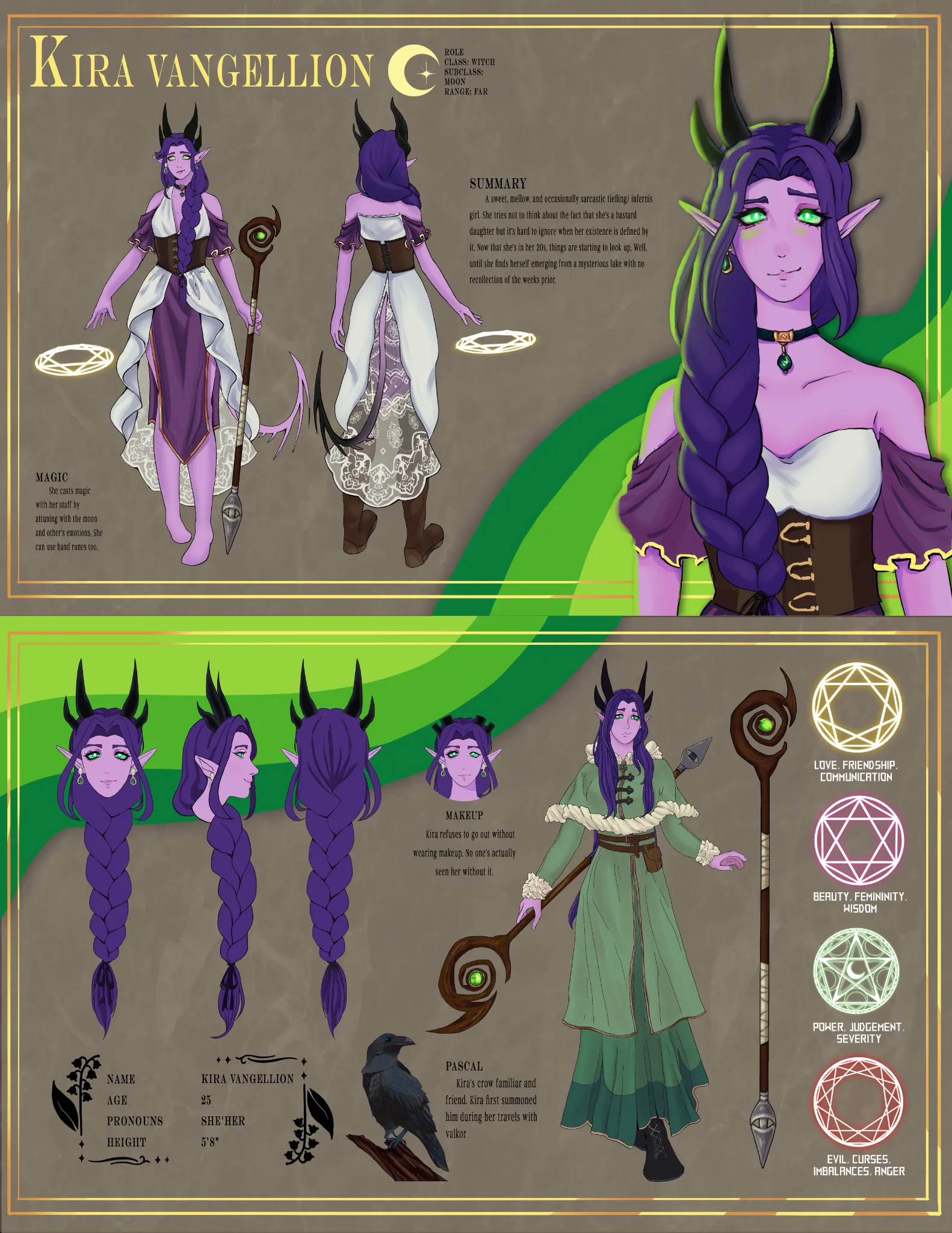
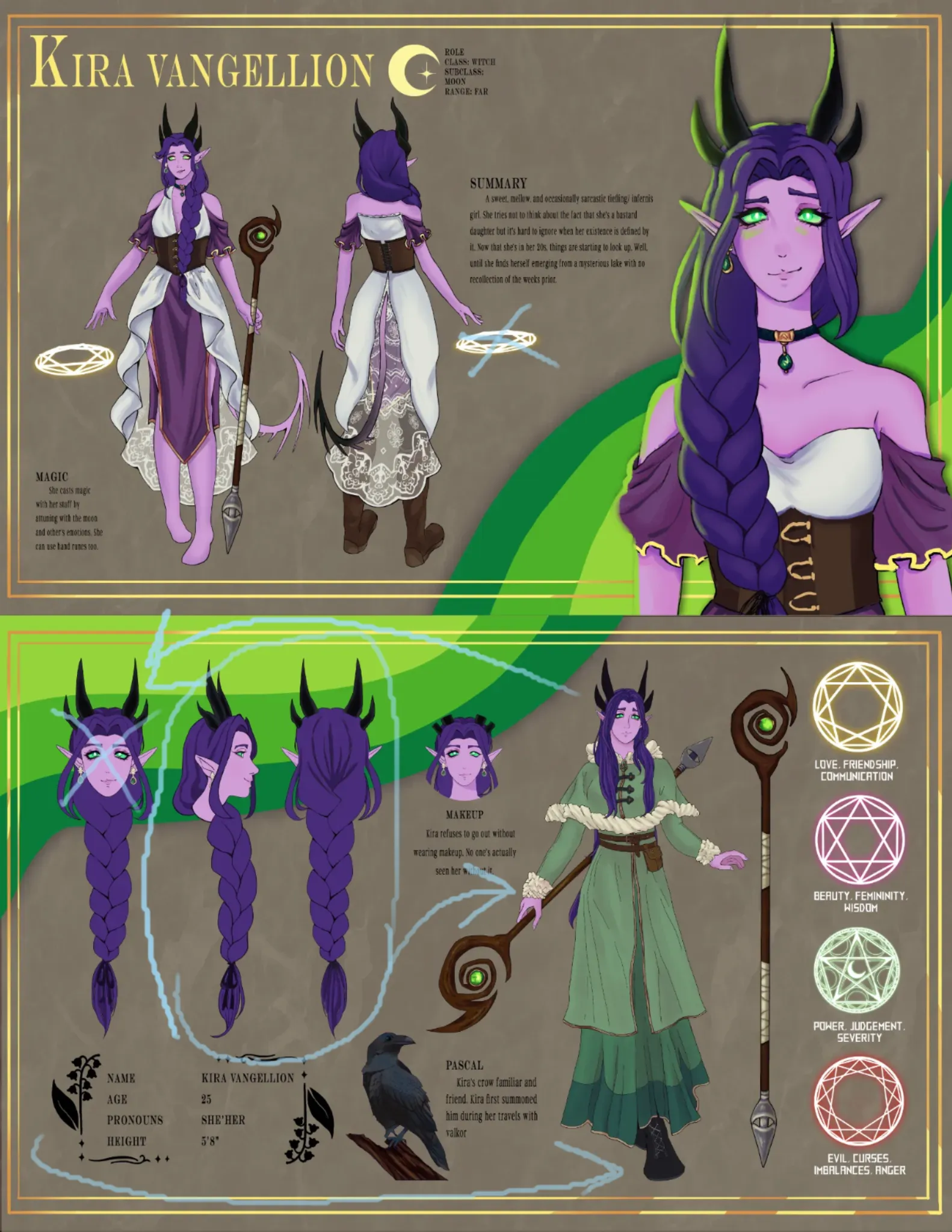
Ok, you have a great concept here, but it is a little busy in certain areas. With the top page, it is good, but you don't need two spheres of magic, just when she's facing the viewer. On the second page, it is a little busy, I would recommend letting go of the first head that is front facing as you have that already on the first page, you just need the second and third to show off her hair and side profile. Also, switch the full body on the second page to the far left, shifting everything else to the right. But the concept is strong, and the character design is solid! Keep up the great work!
Paintovers (1)
Comments 1
Character reference sheet

Artist's notes:
Not feeling satisfied with this reference sheet. I feel like there's something lacking, or maybe there's too much? How would you edit this to look more professional (btw redoing the boots on front facing image rn, which is why her dogs are out).
10