Want to store your feedback?
Sign up to store all your feedback in one place on your account. Your feedback will be private instead of public.
Paintovers
Paintover Notes
Choose a paintover
Pick a user avatar to see their paintover notes and discuss them.
Also need help with rendering?
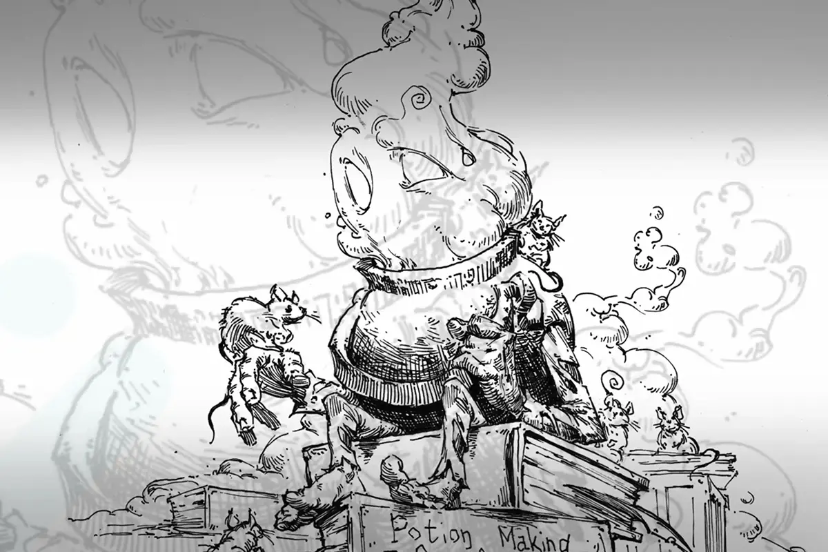
Improve your values and blending, a 3 min read
Easy Art Pen & Ink Rendering Techniques
Master pen and ink rendering through four progressive exercises: build value scales, shade basic forms, study organic objects, and create imaginary inventions using texture and light.
Rendering
Would you like to help someone who's still waiting?
Rendering
No responses yet
Does this work
It should work
View
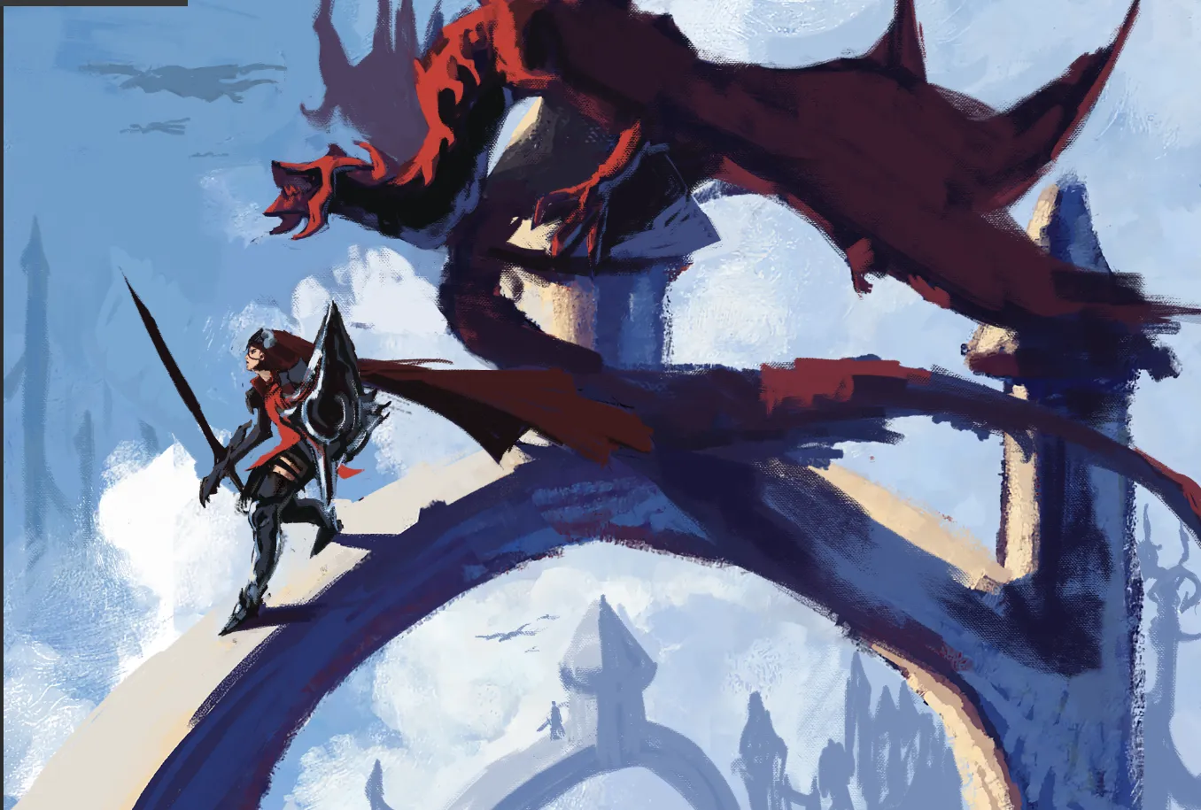
Environment
No responses yet
My Artwork
I'm struggling with perspective, form&depth, composition, values, light/color, anatomy, design
View
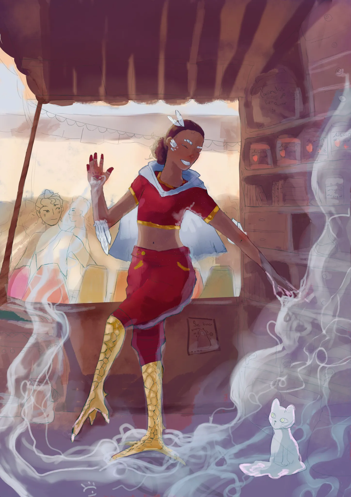
Rendering
No responses yet
My Artwork
I'm struggling with perspective, composition, values, light/color, anatomy, line quality
View
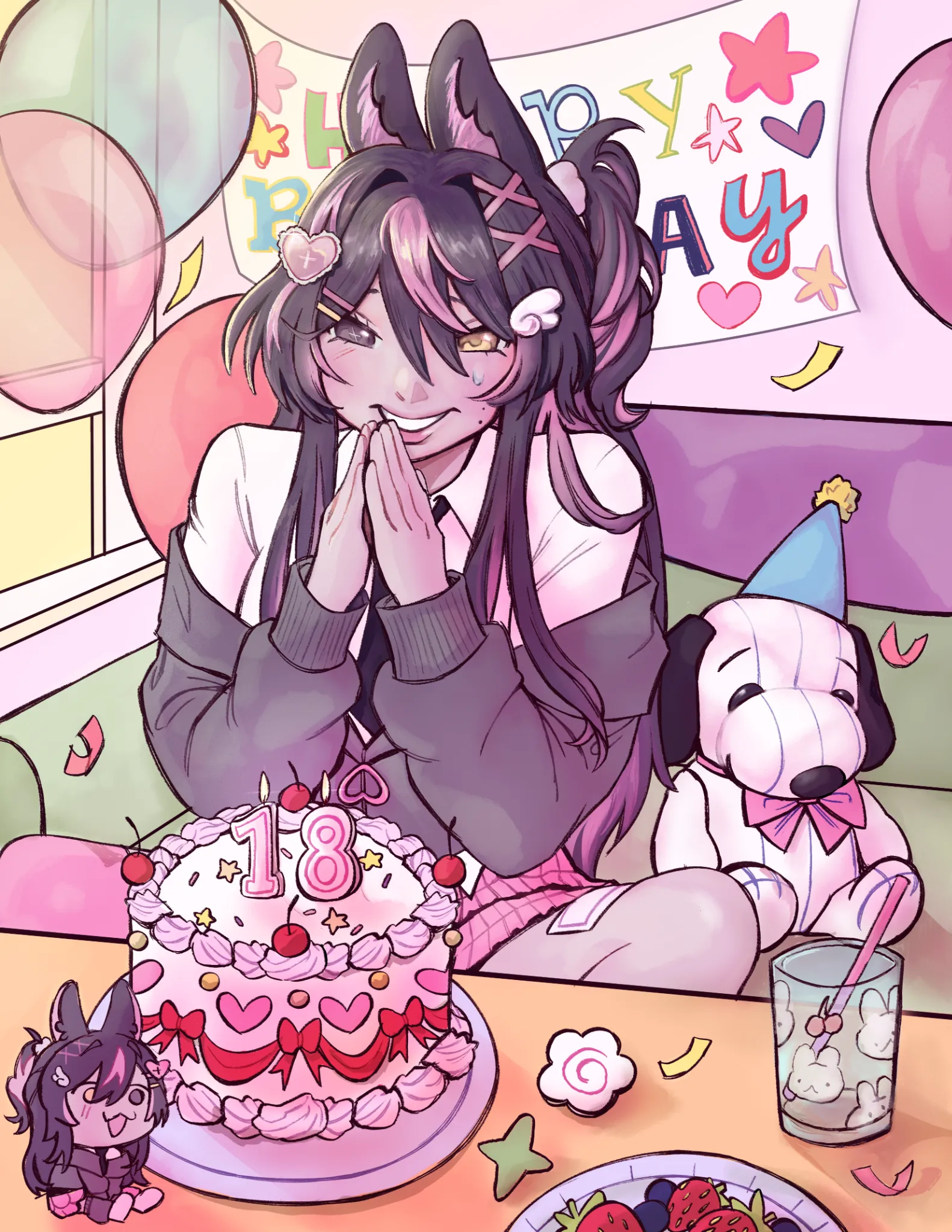
Anime
No responses yet
My Artwork
I'm struggling with perspective, form&depth, composition, values, light/color, anatomy, design
View
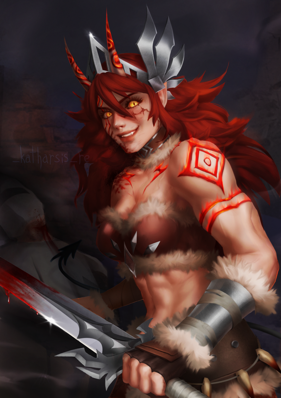
Rendering
No responses yet
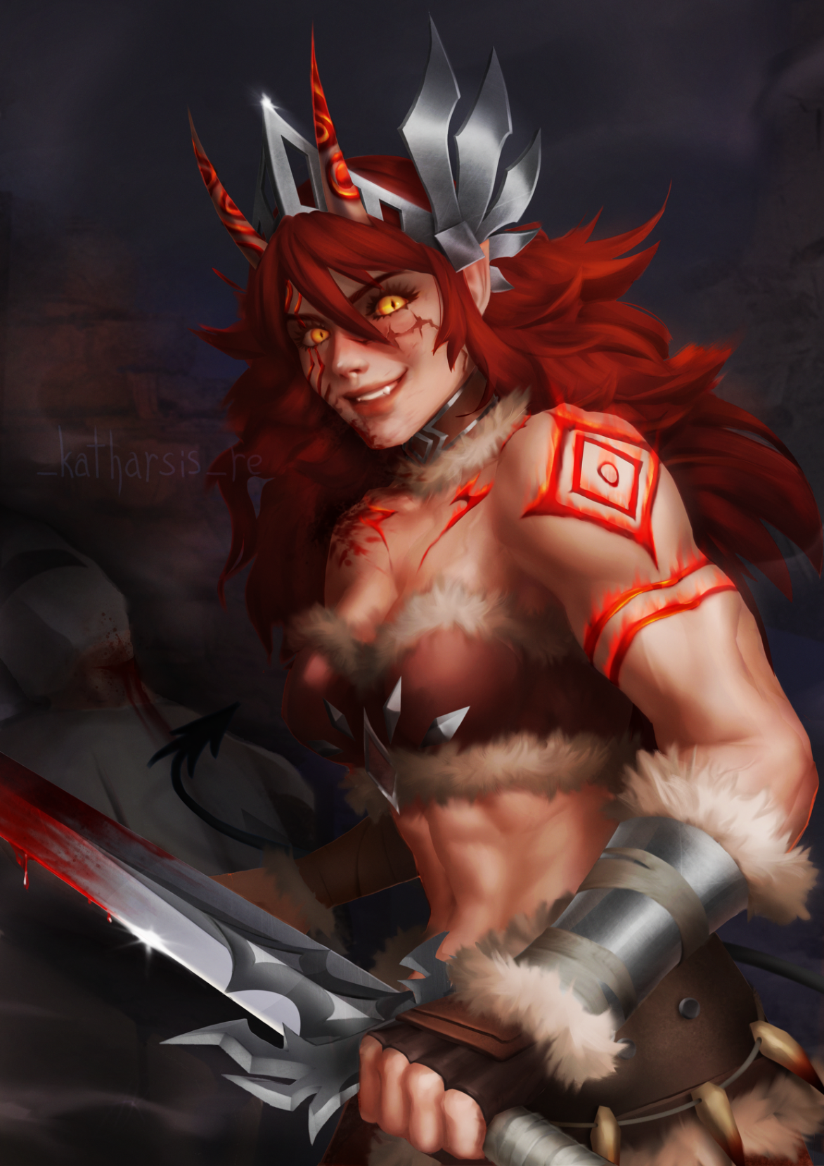
Azazela
Hi, its my second art in technique from grayscale to color. I don’t know, i did grayscale and I really like the values, details etc, but when i colored it - it seems like colors have ruined my values( Also that thing with front hand - i mean to do perspective deformation but it looks weird
View
Rendering
No responses yet
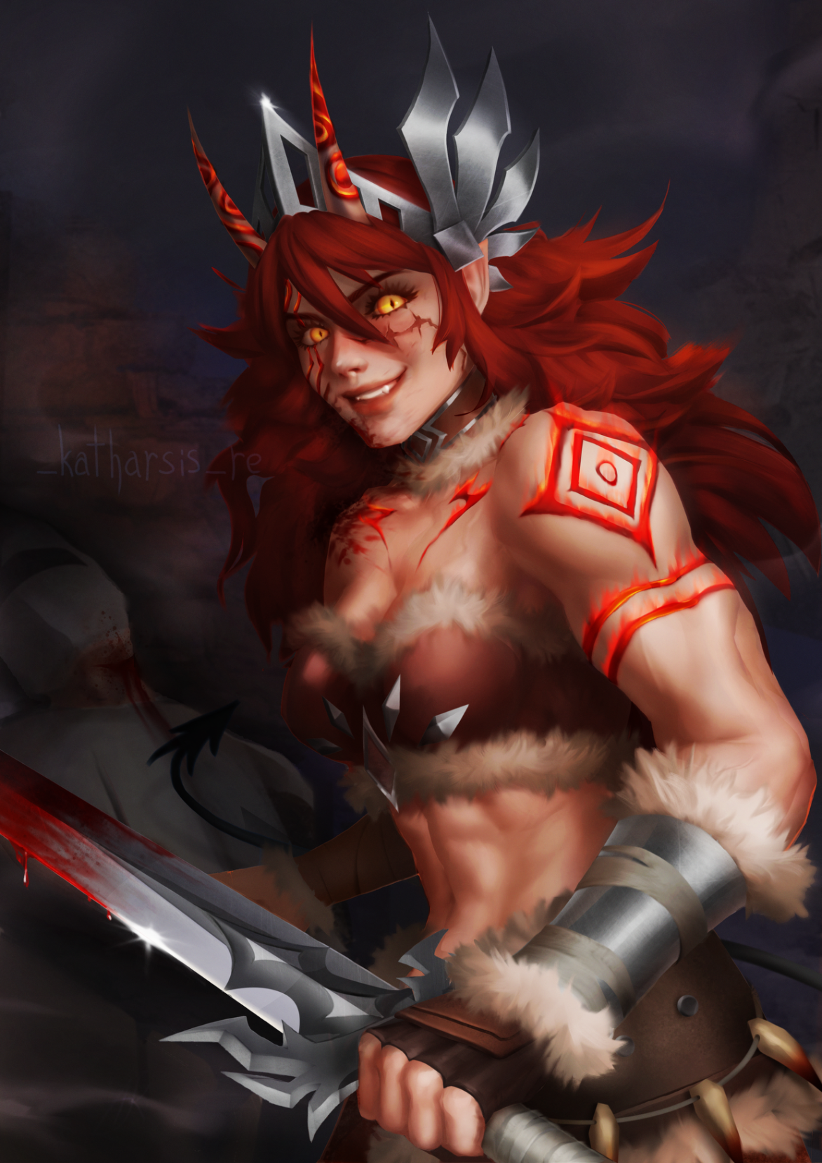
Azazela
Hi, its my second art in technique from grayscale to color. I don’t know, i did grayscale and I really like the values, details etc, but when i colored it - it seems like colors have ruined my values(
View
Environment
No responses yet
My Artwork
I'm struggling with form&depth, composition, light/color, line quality
View
Portraits
No responses yet
My Artwork
I'm struggling with composition, values, light/color, anatomy
View
Rendering
No responses yet
My Artwork
I'm struggling with perspective, form&depth, composition, values, light/color, anatomy
View