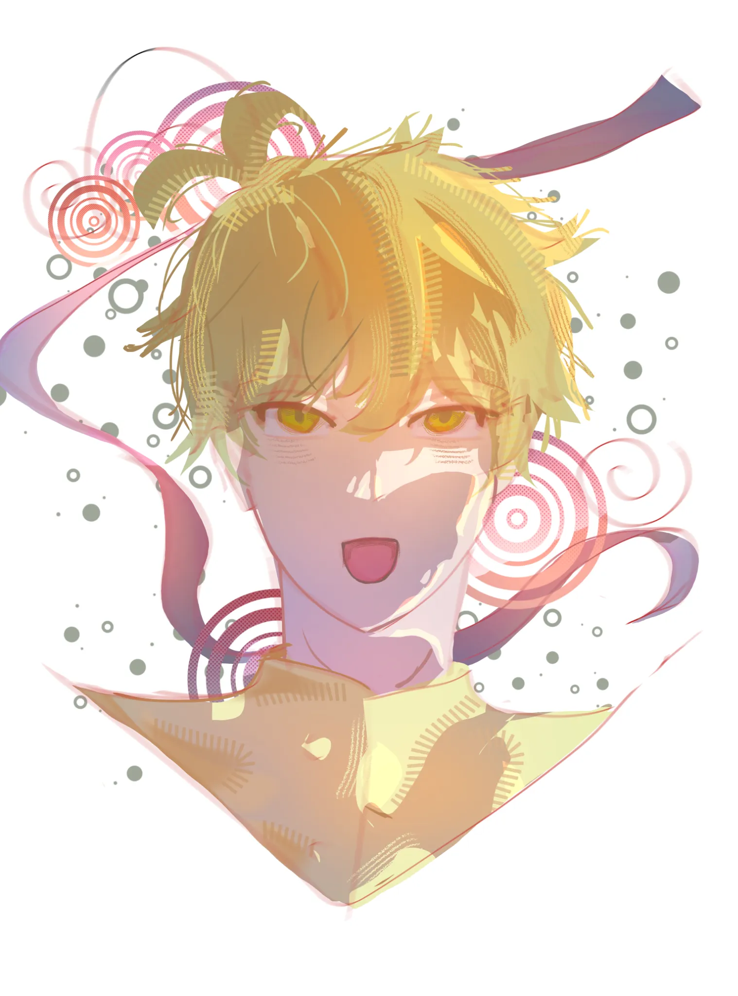
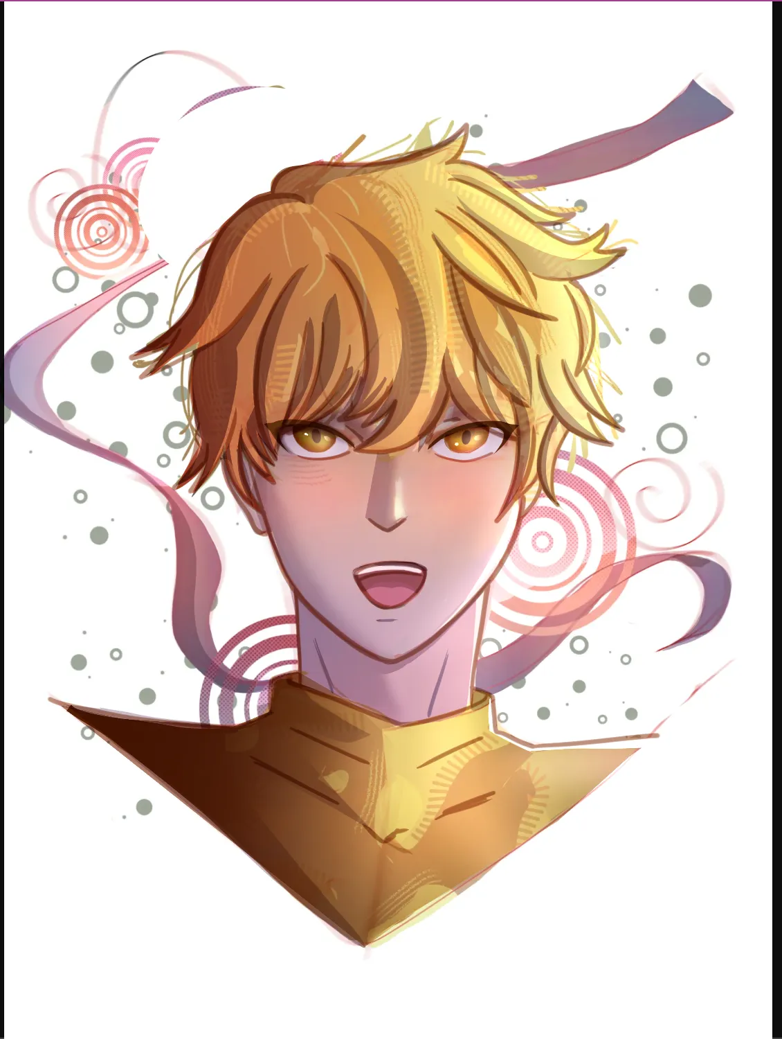

Hello! First of all, I should mention that, unfortunately, some of the textures you created were lost during my corrections. This happened because I added new layers on top, which covered those areas—but I actually wanted to keep them, as they’re really lovely and make the drawing much more interesting! Another great aspect of your work is the color combo; you have a good eye for it—well done! So, what’s the issue? The main problems are the lighting/shadows and the level of definition. The shadows are inconsistent; looking at the drawing, it’s hard to tell where the light is coming from. I’m guessing it’s from the left but if that’s the case, for example, why is the right ear illuminated? To help with this, you could look at some references—Pinterest has plenty—or even observe a real face. For now, I’ve added some very subtle shadows just to give you an idea. To add shadows, simply create a new layer and set it to "Multiply" mode. You can choose any color or gradient you like, but be careful not to pick a shade that’s too dark, or the shadows will end up looking overly heavy. As for definition, the lack of lines makes the drawing feel a bit flat, and there weren't enough shadows (especially in the hair). For a drawing to look "right" or realistic, it needs to have a sense of 3D volume. While shadows help with this, adding a line-art layer can really bring the drawing to life and help distinguish the different elements. My line-art here was done very quickly and rather sloppily, but notice how it helps define the figure much better? By the way, I’d definitely keep the lineart colored— you had a really good idea! I also removed those odd tufts of hair on the head. If you want to include spiky or upright hair, that’s fine—but the ones you had were a bit too thick and didn't follow the natural contours of the head. Also, take some time to add a few extra effects. I added some shading to the eyes and hair, a bit of sparkle to the eyes, and a touch of color to the cheeks. You don’t need to do anything too elaborate, but this helps with definition and adds more variety to your colors, making the whole thing look less flat. I hope my explanation makes sense; all you’re really missing is a bit more experience and some study of how shadows work. If you have any questions, I’m here.

THANK YOUUU