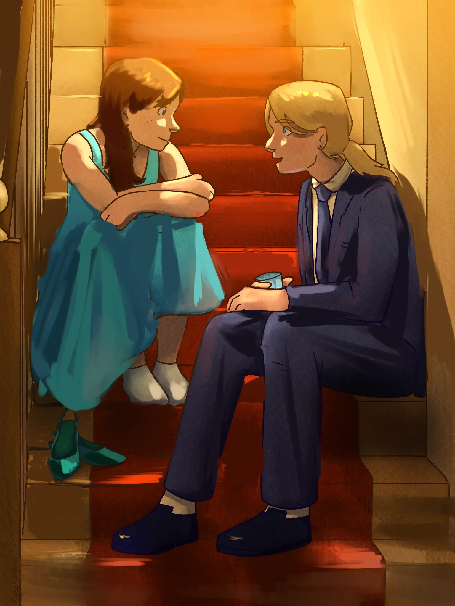
Lazy bastard
#10
Place
225
Votes positifs
154
Retours donnés
100%
Utile
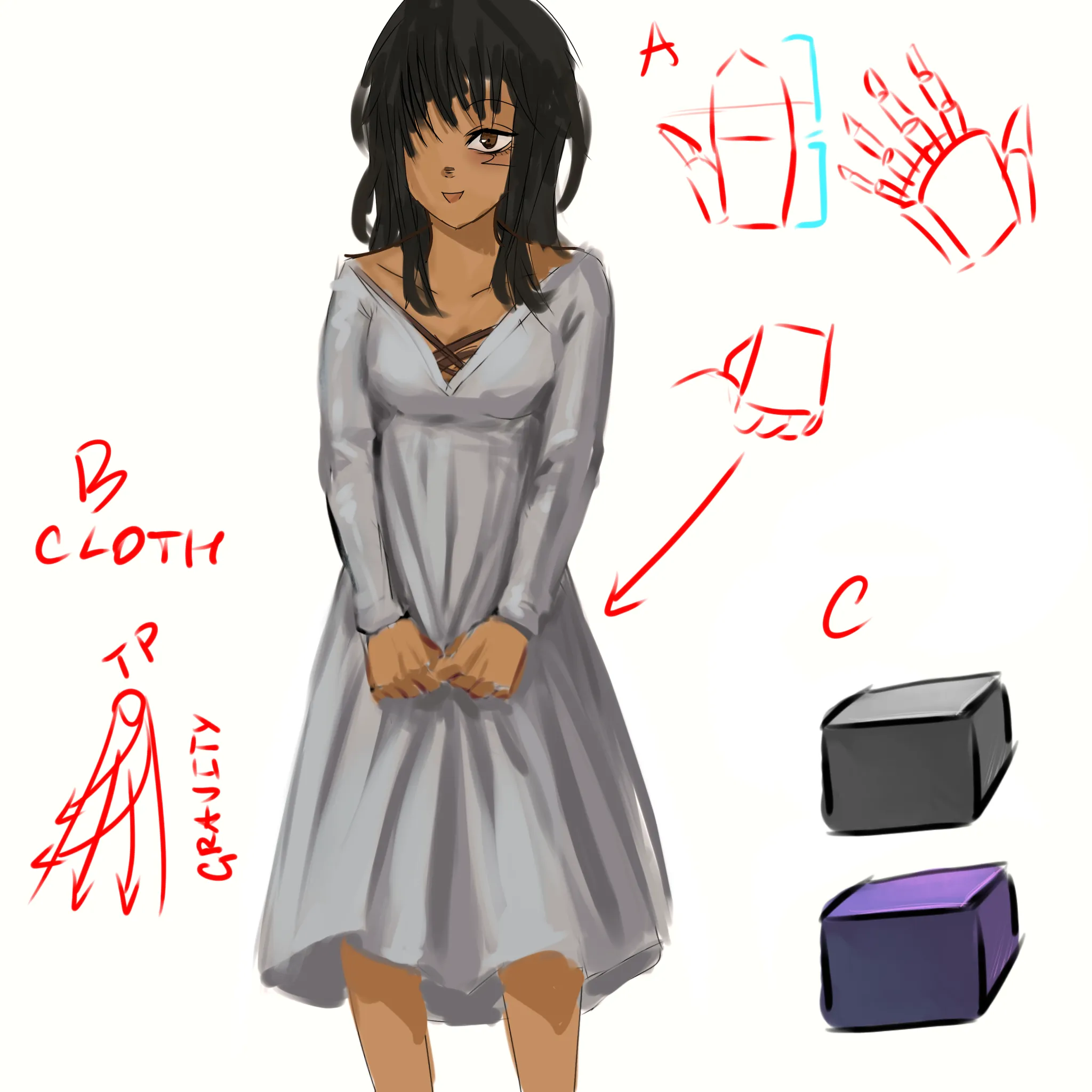
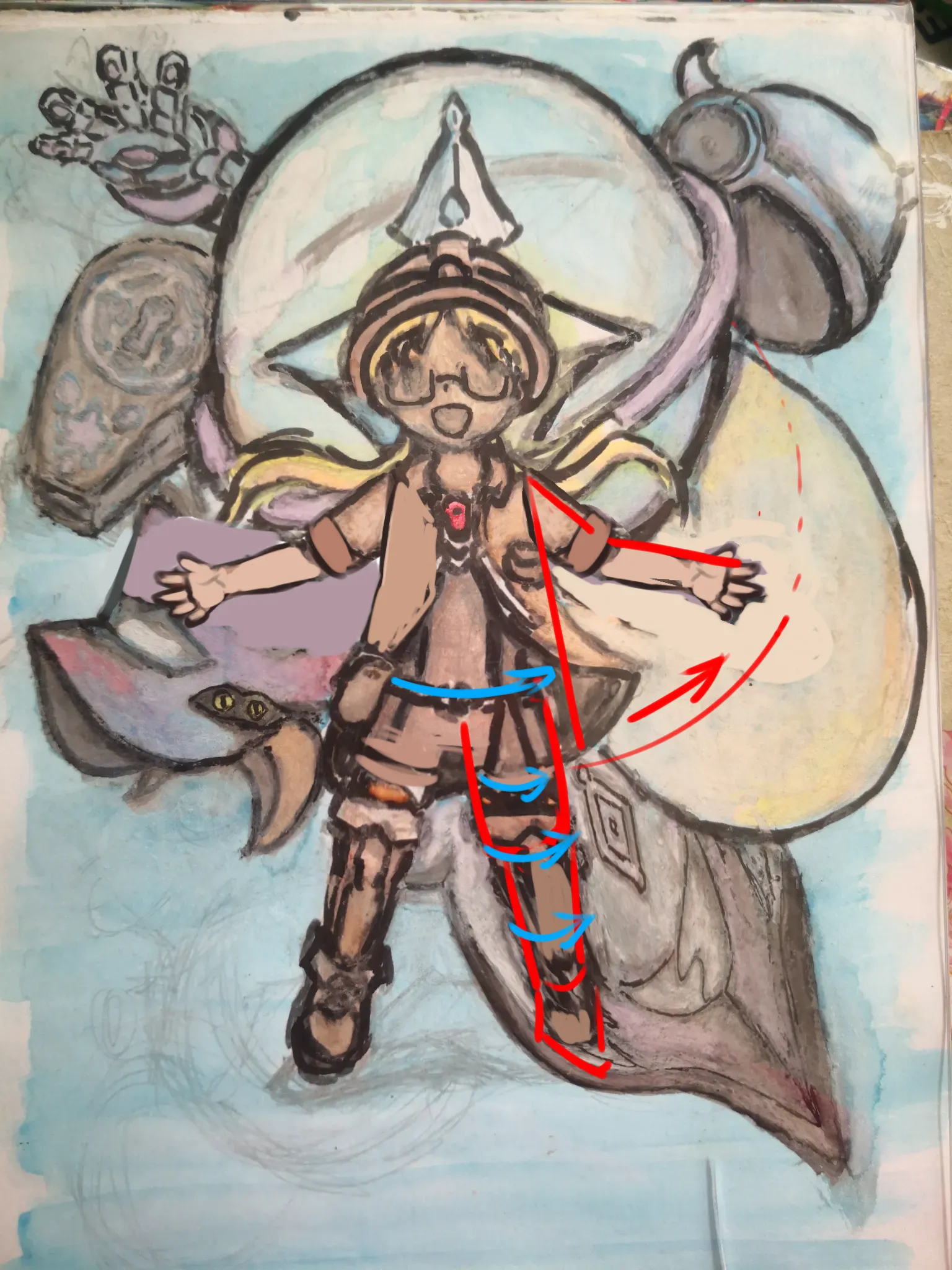
“Hi! Hands are really hard to draw. Each of the points you struggle with is an own topic. I would suggest looking up tutorials for them - it is impossible to cover it all in a small feedback box. ”
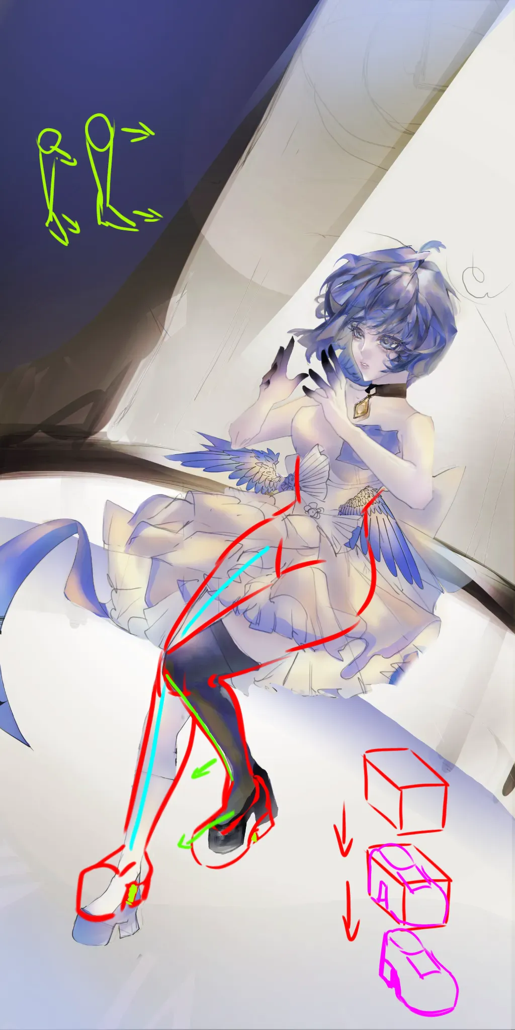
“Hi. The limbs look off because her arms are too long. To determine length: hands should be around base of the pevis area, the arm length doesn't change much when rotated around the shoulder. The”
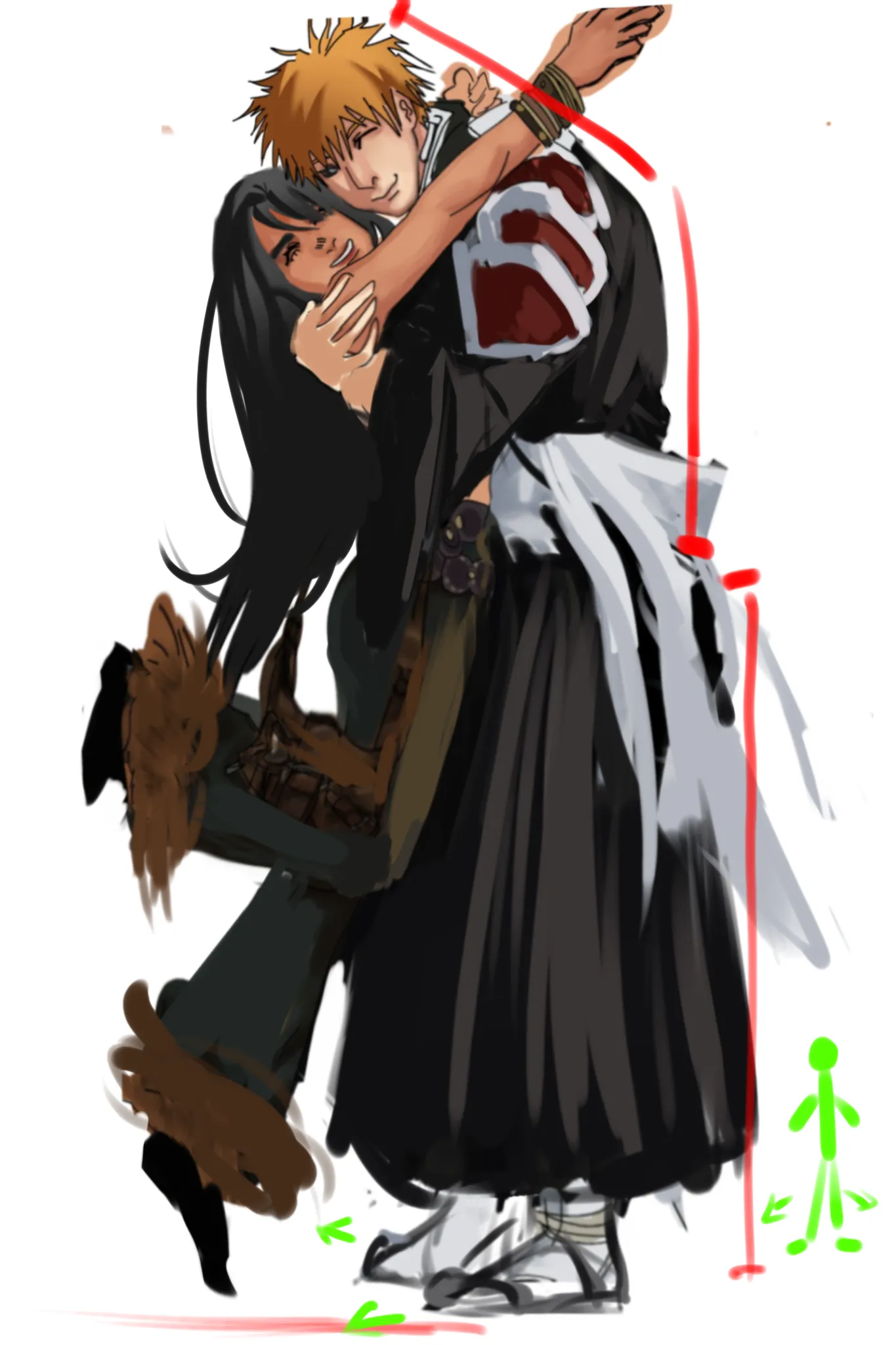
“Hi! Love to see yumeships here - they are so rare 😭 It looks odd because the proportions and perspective are all over the place. We seem to have side view of the female character but front view”
“Hi! It feels bland because - you just use darker value if the same color for shading - use pure white color - have cluttered background which steals all the attention from relatively simple de”
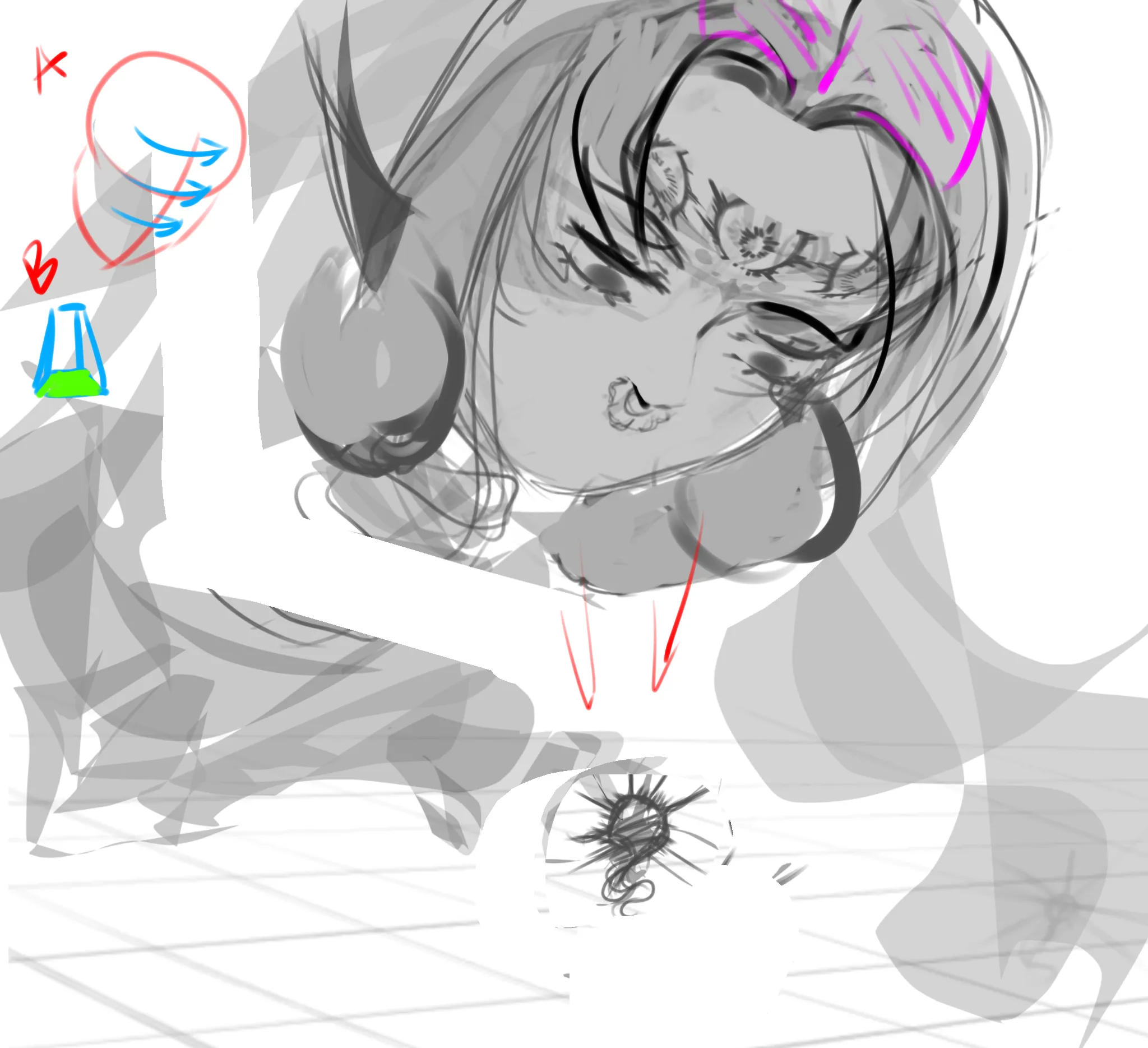
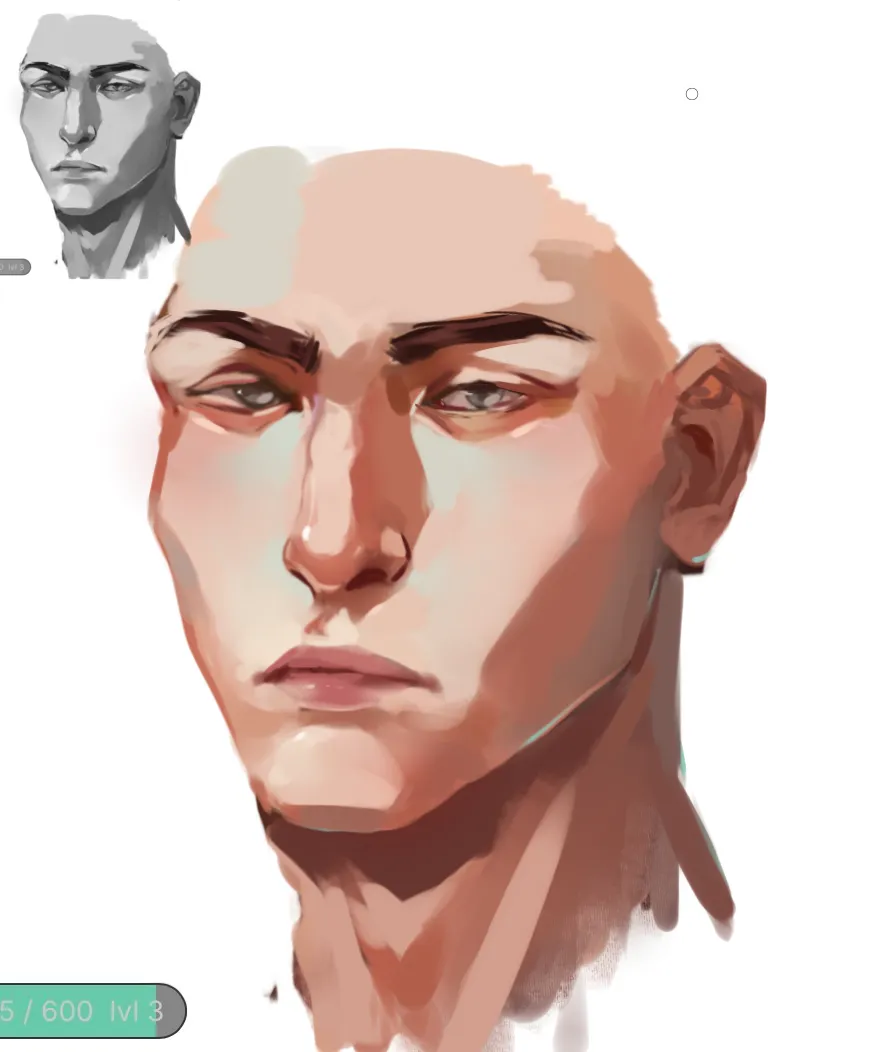
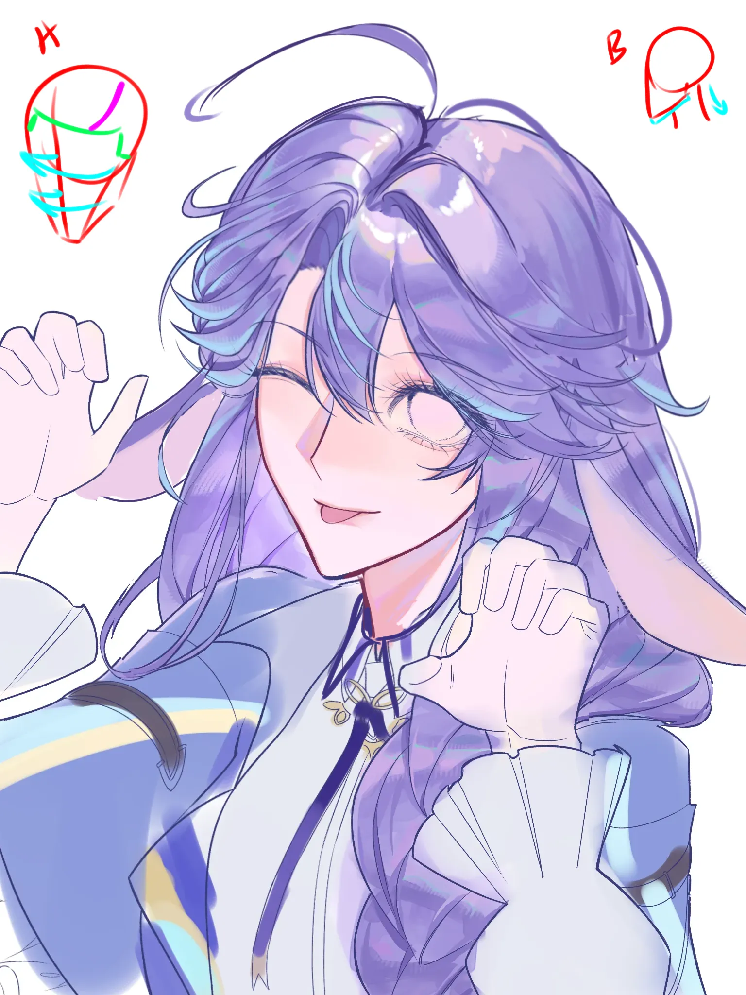
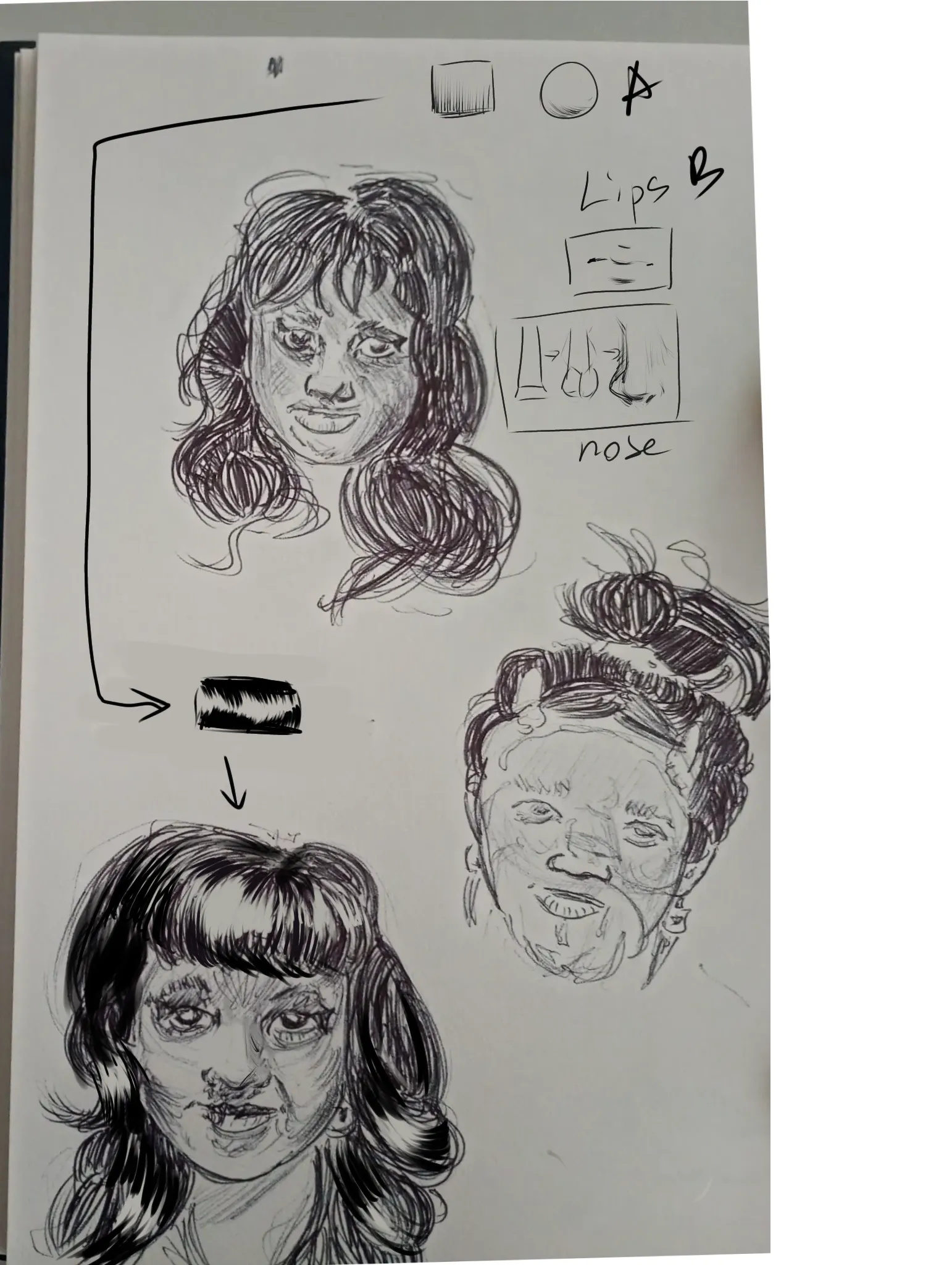
“Hi! It looks off because you treat the face as a flat plane. Skull is a modified sphere - features should wrap around it (see A) and have volume. We should see more of the top of the head (and t”
“Hi! I think the drawing has pretty good color base, values are ok for the most part. It just needs a bit more color variation, saturation and a few highlights to make things pop. For flat feelin”
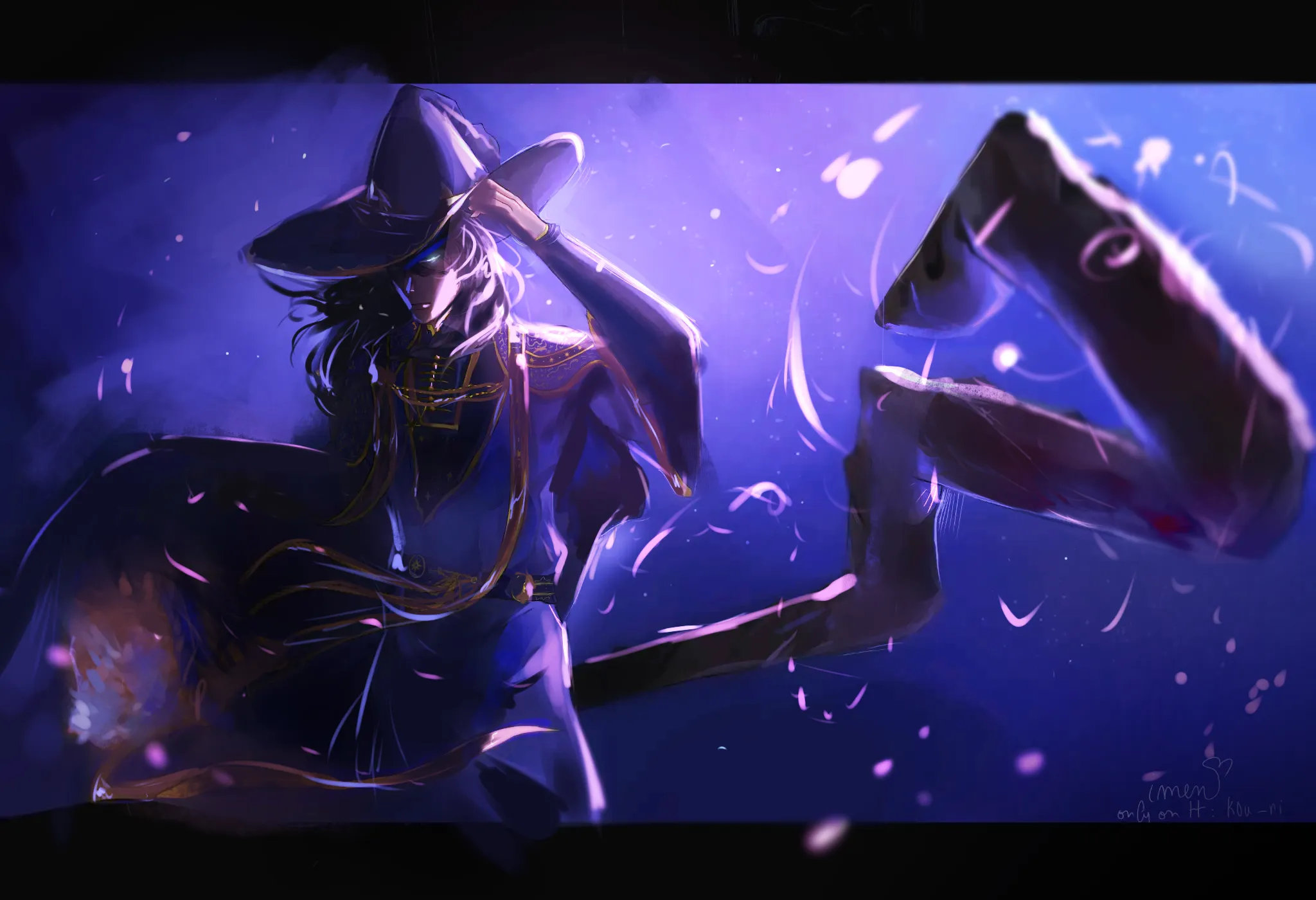
“Hi! Following feedback is given under the assumption that the character is the main focus. I feel like the staff, the mage and flowers in his hand are fighting for attention. Rule of the thumb: ”
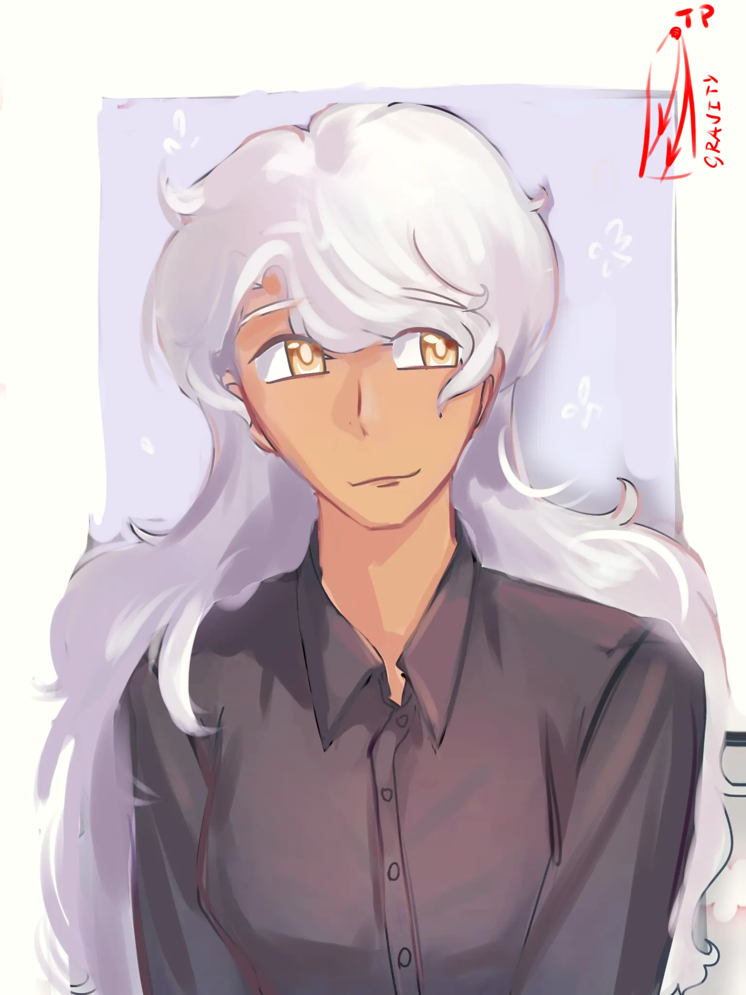
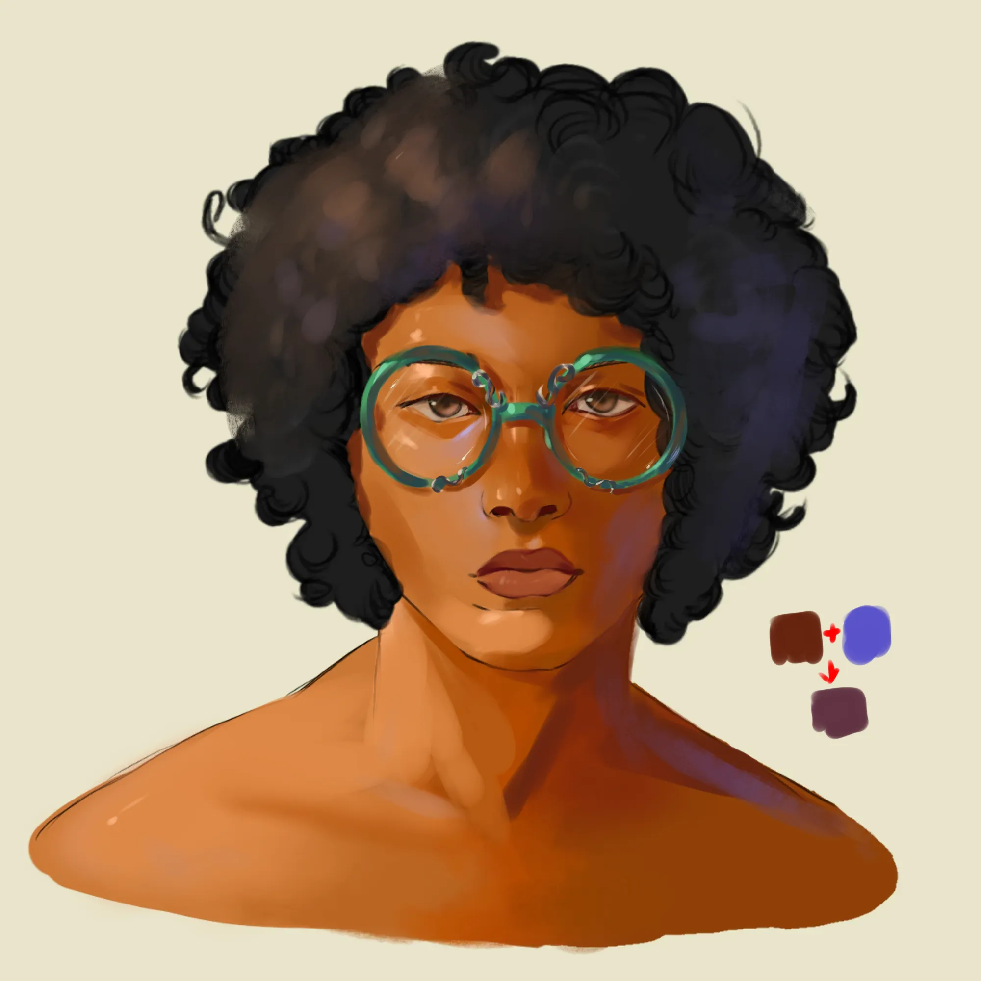
“Hi! I think you got pretty good base colors. Dark skin contains more melanin which affects how light is reflected back by the blood under the skin. The colors would change hue accordingly to m”
“Hi. I think you set up yourself for a difficult journey by jumping straight into colors/rendering. A very experienced artist may get away with it but us mortals should start with basic construction”
“No paintover, just tipps. If you want to create a design, you need to consider following points: - what is the purpose of the design (will it be used for illustration, animation, game, etc.). Th”
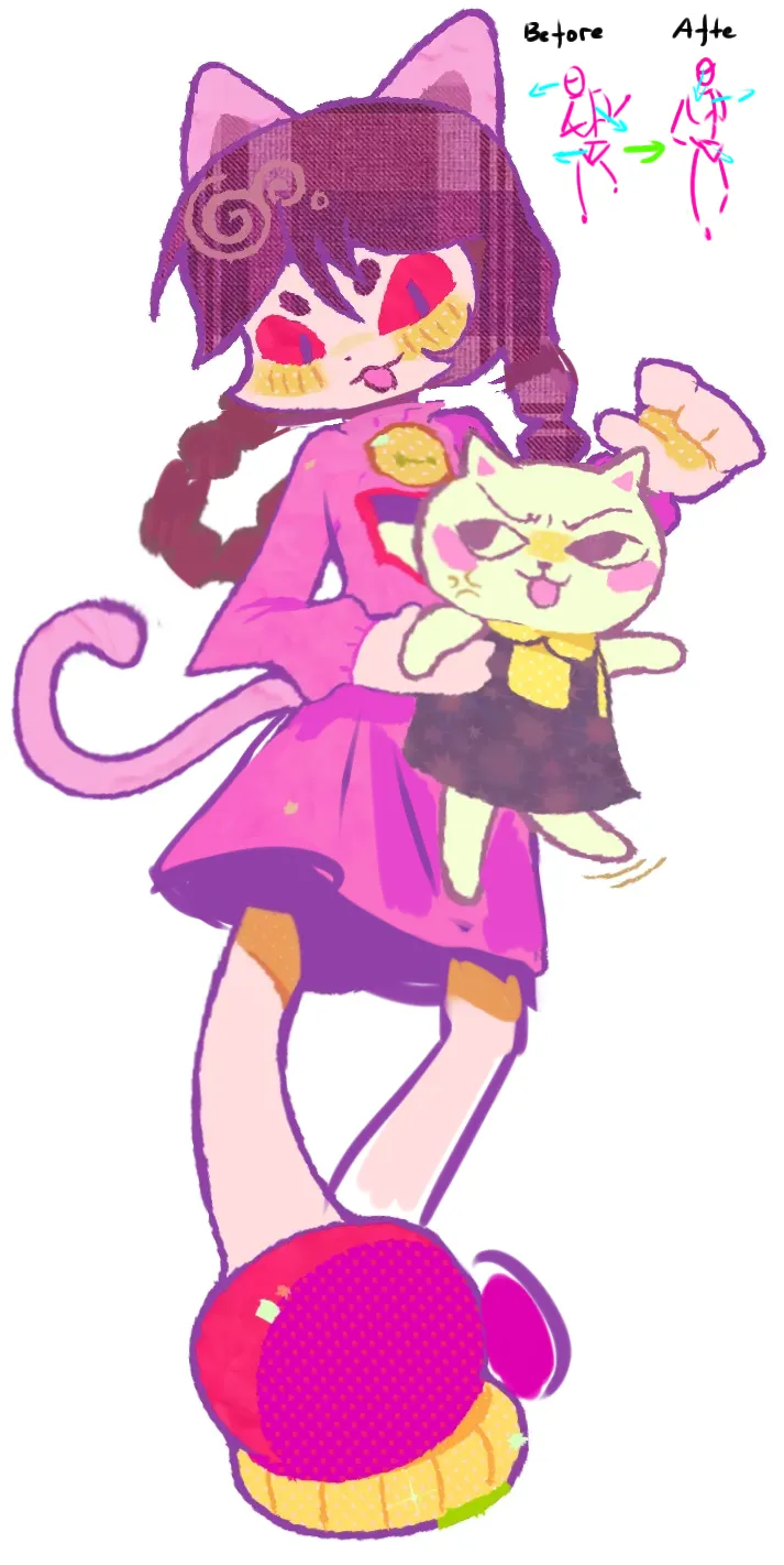
“Hi! Love the color choice and the pose. The pattern on the hair is a really cool design choice. The pose looks strange because the basic construction is off. Even highly stylized drawings need ”
“Hi! Nice expression and colors! Humans come in all shapes and forms, besides you can get away with a lot in stylized drawings. However, if you want to be closer to the standards, a few points: ”
“Hi! Feet are definitely hard. What you could try is to draw them as boxes first and then carve them out. It works especially good with platform shoes like this. Don't forget that heels are also sor”
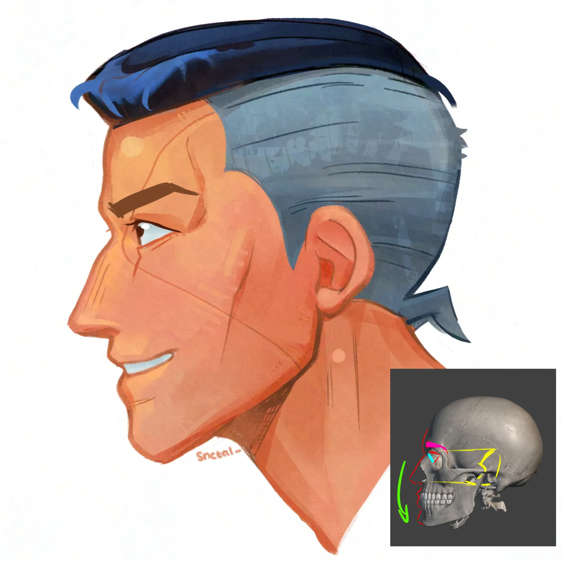
“Hi! Pretty colors and beautiful lineart for hair. Really love those eyelashes! For the head: - It is a bit too elongated on the left side (ours). Remember, head is kind of like a sphere, feat”
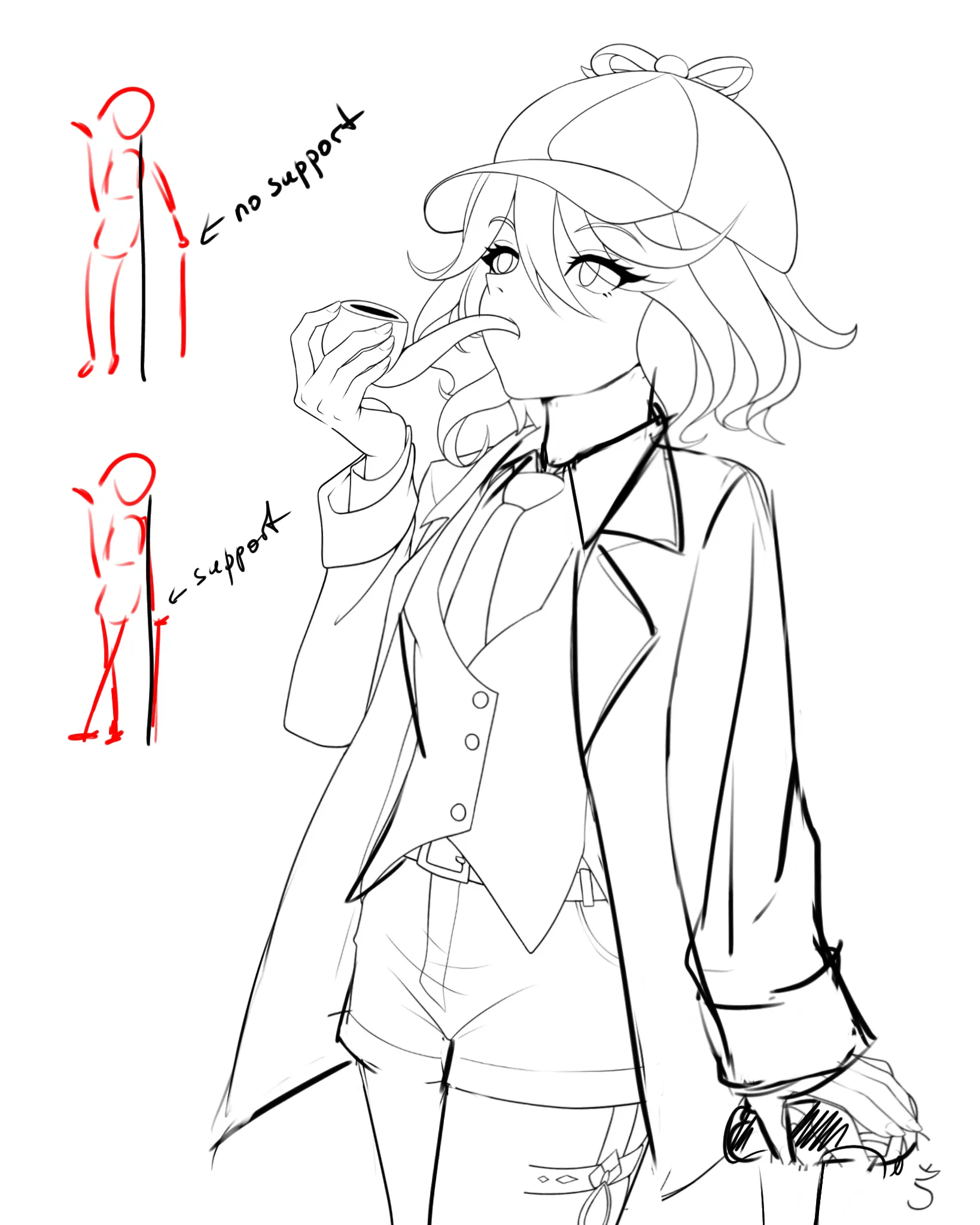
“Hi. The proportions are roughly ok (although the lower part of the body appears to be a bit too flat and small, especially compared to very thick legs; neck also could use a second look; back of th”
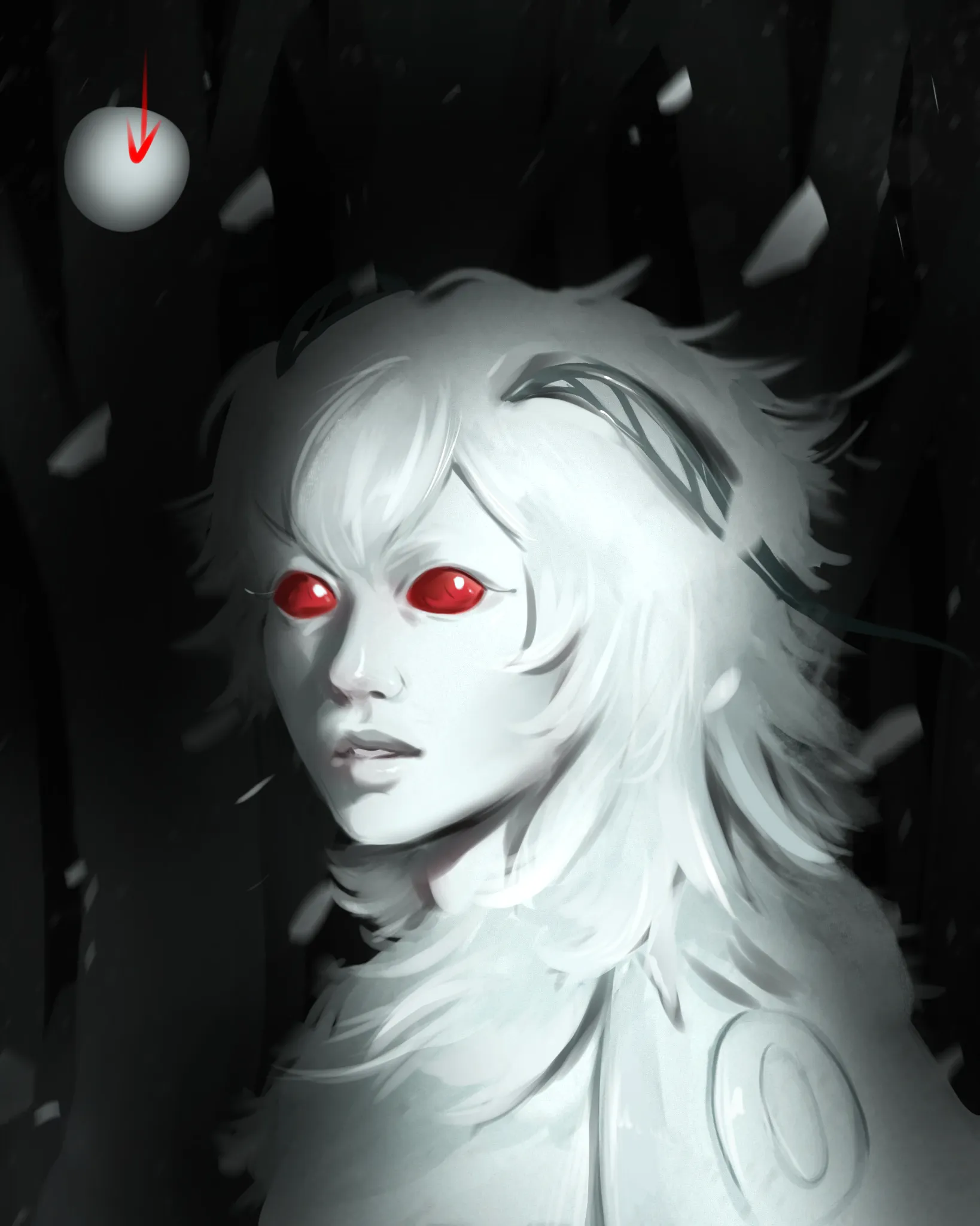
“Hi! The idea is pretty cool! The color choice is good as well. For such lighting you need to work with very dark shadow, high contrast and string highlights. The problem is that her entire form ”
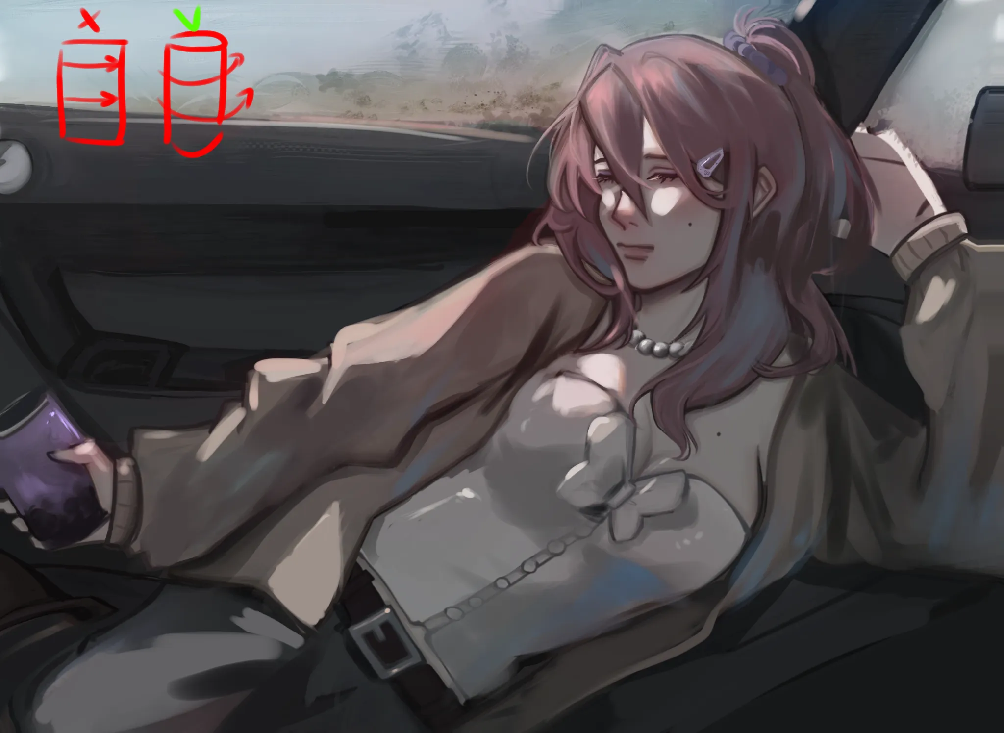
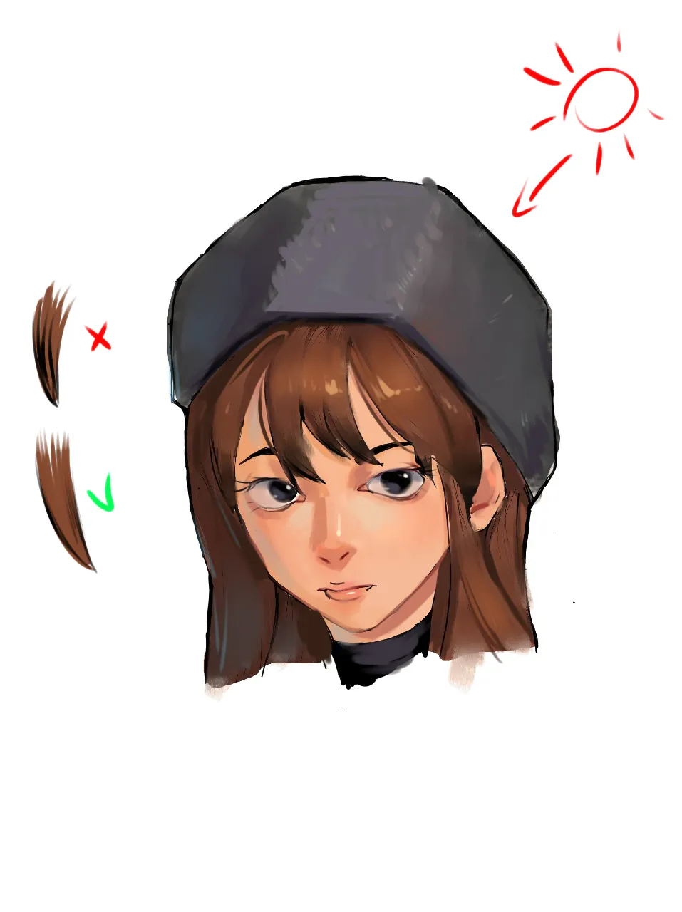
“Hi! That is a cute design! I think the shading looks off because parts of the drawing are rendered with different light sources in mind - her body is shaded as if light comes from top left, but ”
“No paintover but if you want to learn rendering: 1. Do shading exercises of simple shapes like spheres and cubes in different light environments. 2. You can extend that exercise by shading thos”
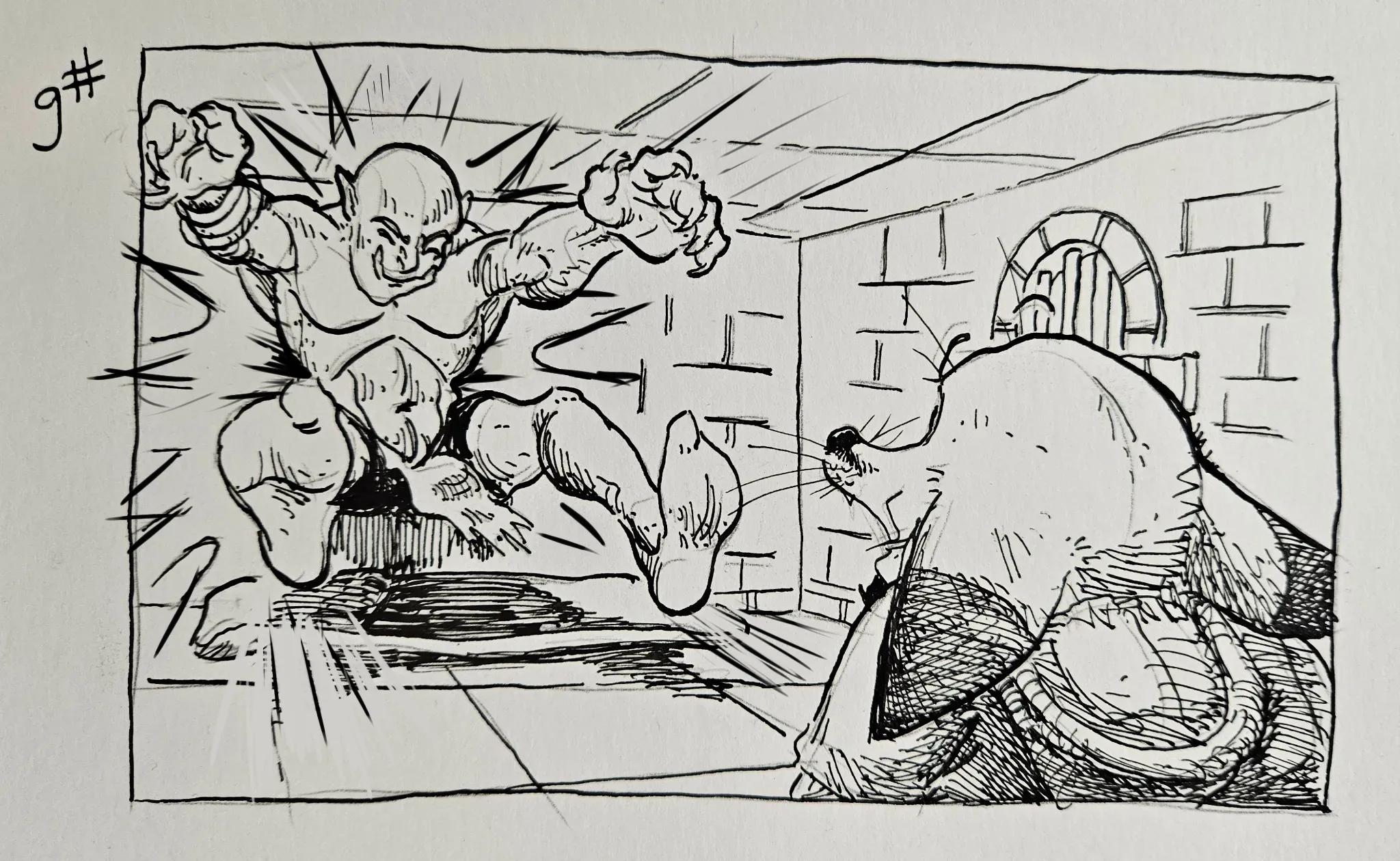
“I love the series so far 🍿 I am not a comic expert but I feel like if you added more motion/crash lines and deeper shadow around ogre's body (center of crash) it would empathize the crash more and”
“Hey! Love how the lighting and color choice for this one lead the focus to the character nicely. Things to improve: - her face seems to be distorted/squished. Would be a good idea to check t”
“Hi! The form is pretty interesting and proportions are all right. It seems you are half way there? What could be changed: 1. Her face is shaded as if light comes from the top right but her ha”
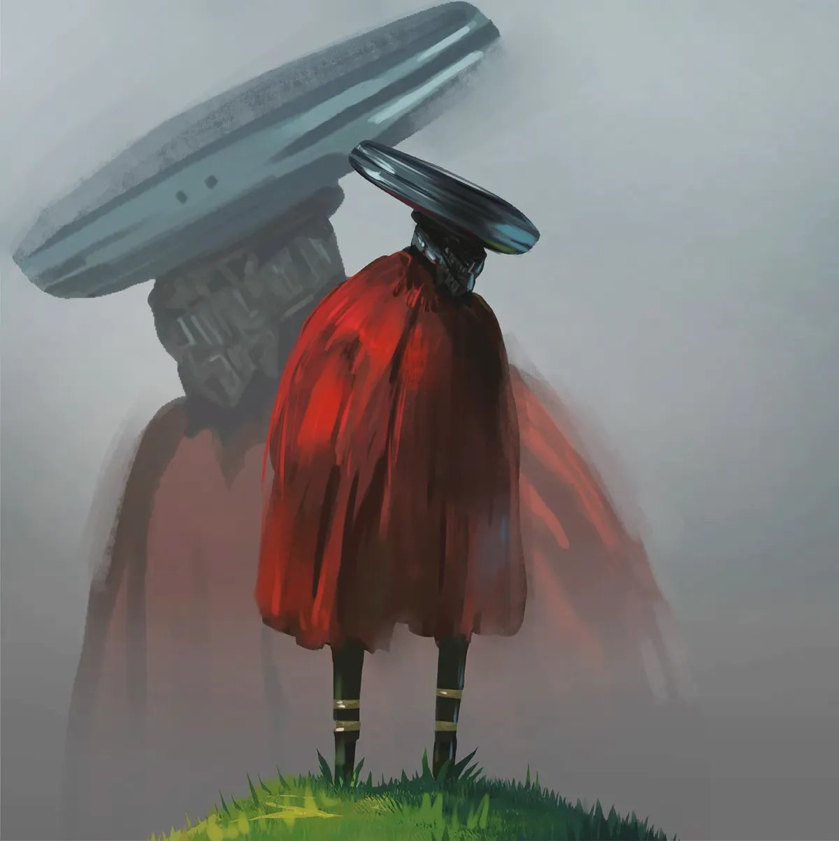
“Hi! I feel like there is a missmatch between values and saturation of the grass and the main figure. I would add a bit more saturation and depth to the character. You could also make it more intere”
“Hi! That is a very wholesome drawing, the colors are fine for the most part. The problem are values and shadows as well as focus. Judging by the shading of her skin the light seem to be comin”
“Hi! I would definitely suggest checking out Artwods portrait road since it is impossible to fit it all in one comment here. Try not to skip base structure. I feel like some features are misalign”