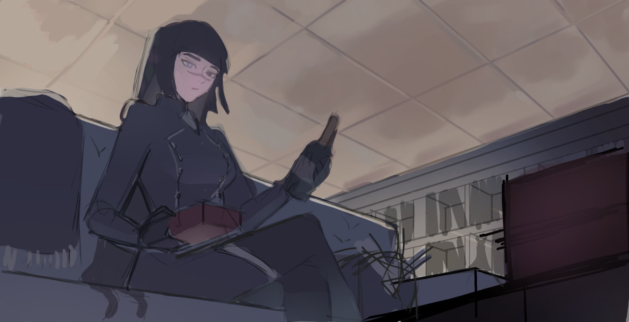
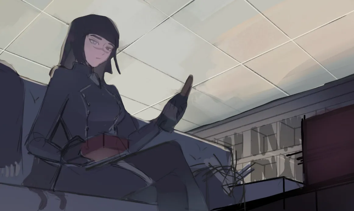

I only made subtle changes to the ceiling, the first being shifting the hue from yellow/orange to green, this gave it a more blue hue which made it look whiter/lighter compared to the warm tones. I also thought that if they were panels why not try sharper lines and mother blending, it gives the ceiling a sharper/cleaner look to fit the white office space. the lines in the ceiling are to harsh so I should have softened them, but hopefully this helps. and yeah I still think rendering the rest of the image will help in deciding the final colours.

Ohh okay i see now, the ceiling feels like one. Also can you explain me the term « mother blending »? if i understand, i dont have to sharpen every line..just few. and make the ceiling cooler
Responder a @ fyoruru
I'm so sorry that was a horrific typing error, *smooth blending. but yes I picked smooth blending with some sharp lines, because it was the easiest way. in your image, the warm patches of colour shown through you style of brush strokes gave the impression of damp or dark spots, whereas if its supposed to be a clean bright office space, than you would expect smoother lighting. there are other ways of doing it but you need a good understanding of brush language how the shape of visible brush strokes effect the way things look, the same way cross hatching works where purposeful lines in the right direction look clean and messy scratches look bad. it also applies to painting. and while yes it's about making the ceiling cooler, you have to be careful to not go too blue, which is why the greys are important. let me know if you have any questions I'll try my best to answer
Responder a @ aiom
Thank you fir answering! For the blending is there a specific spot you have to blend to make it look more like a ceiling? Same thing with greys you mentionned at the end, are there speciifc places?
Responder a @ fyoruru
No I wouldn't say so, there's nothing ceiling specific, and as long as the character stands out it wont matter to much, but to give an answer it comes down to where your planning to put lighting and shadows, and more importantly the art style your going for. always use reference not just of real life photos but of artists work your trying to emulate as for the greys, whenever you transition from one colour to another yellow to green, instead of doing a direct blend of those two colours, you desaturate as they come together. if you look in the image I sent, just above the wine bottle you see a patch of grey, to the left of that patch is blue and to the right is red, if you were to blend normally you would get purple, by desaturating blue instead it looks natural. of course the actual colours used above are desaturated yellow-green and desaturated yellow-orange but the blue and red makes it easier to explain. theres a video on proko's channel by jeremy vickery called: 'the secret to painting the right colour' that will explain it better than I can. other than that, just trying it out and seeing what happens is usually the best way.
Responder a @ aiom
Oh i see, i will go check that video. Thank you for your help!